A Montecito Classic
Beverly Hills, CA
The Story
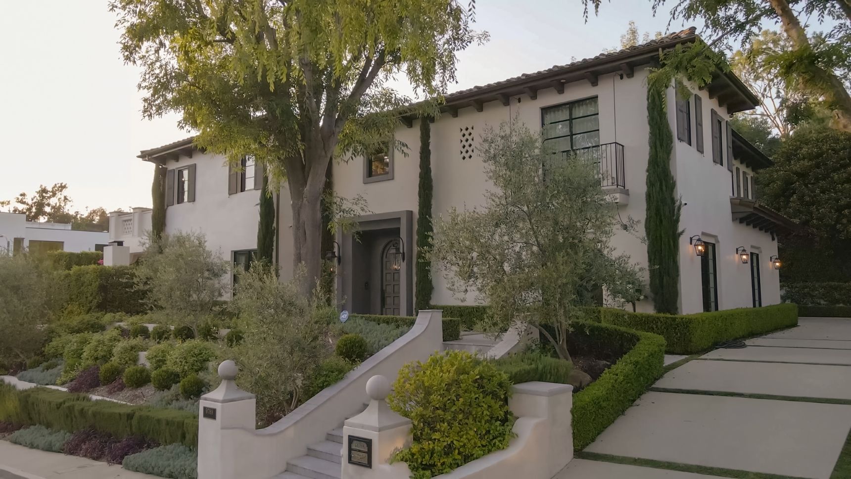
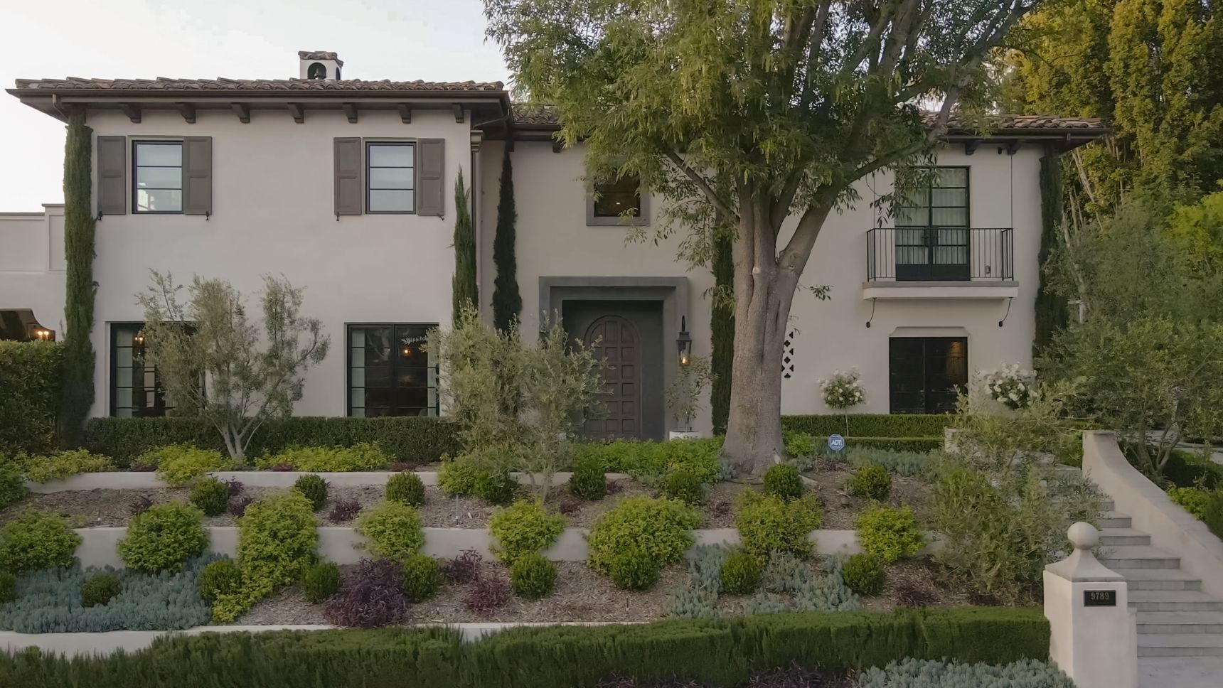
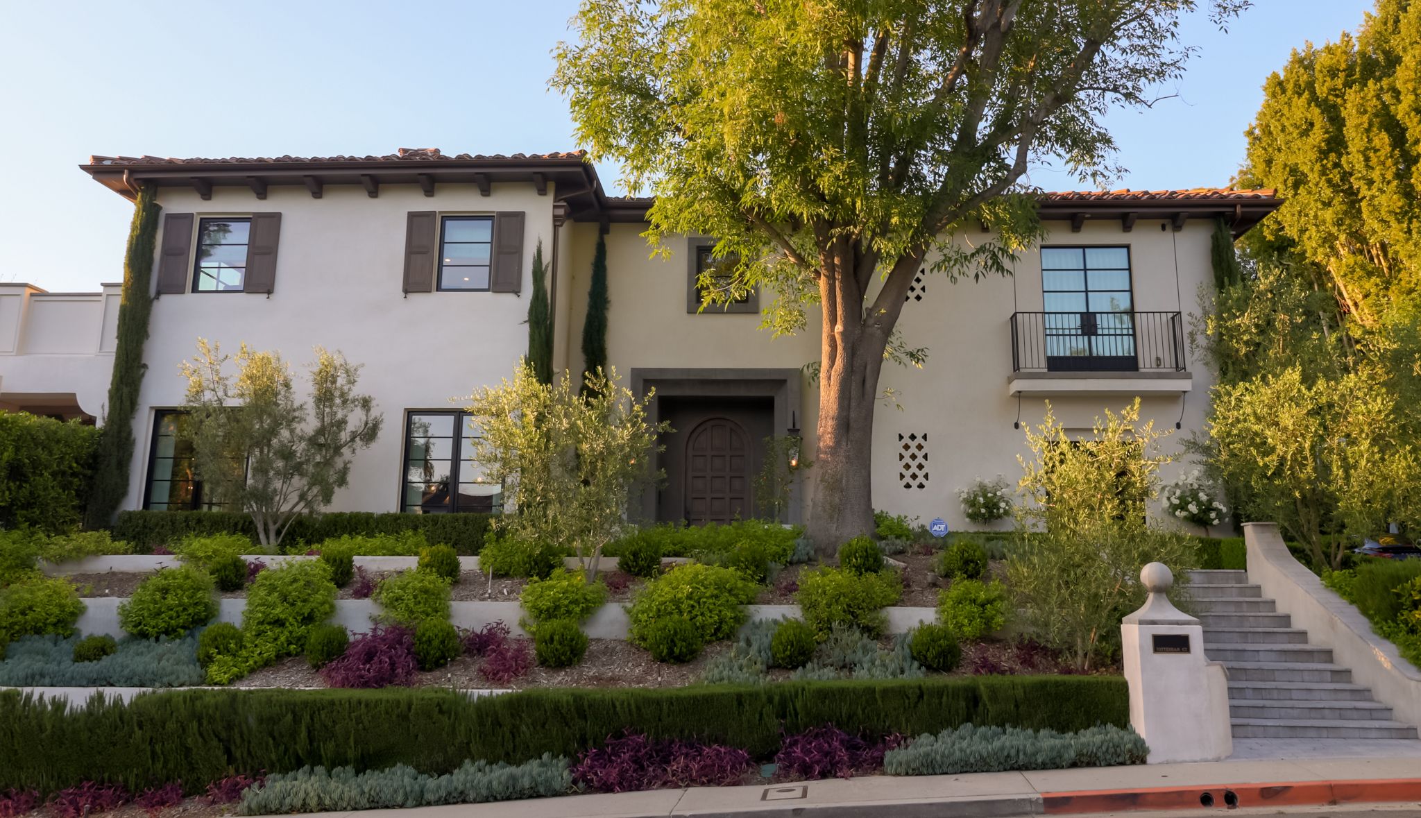
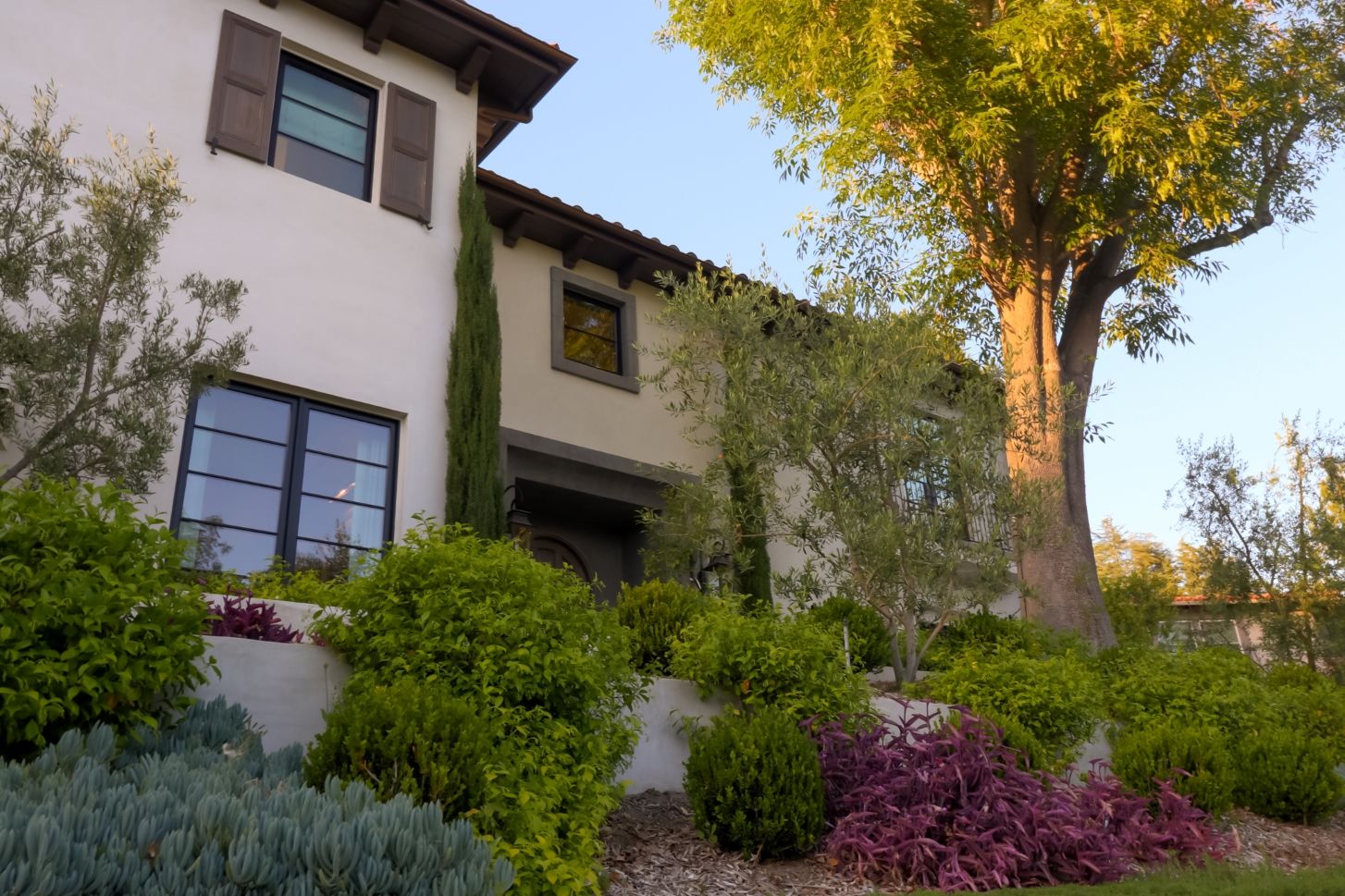
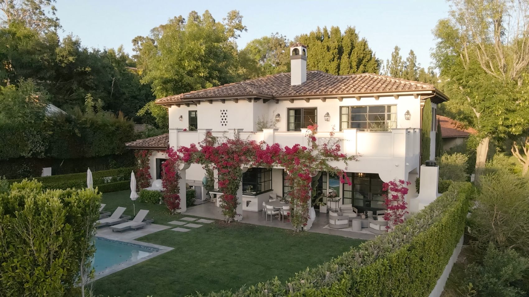
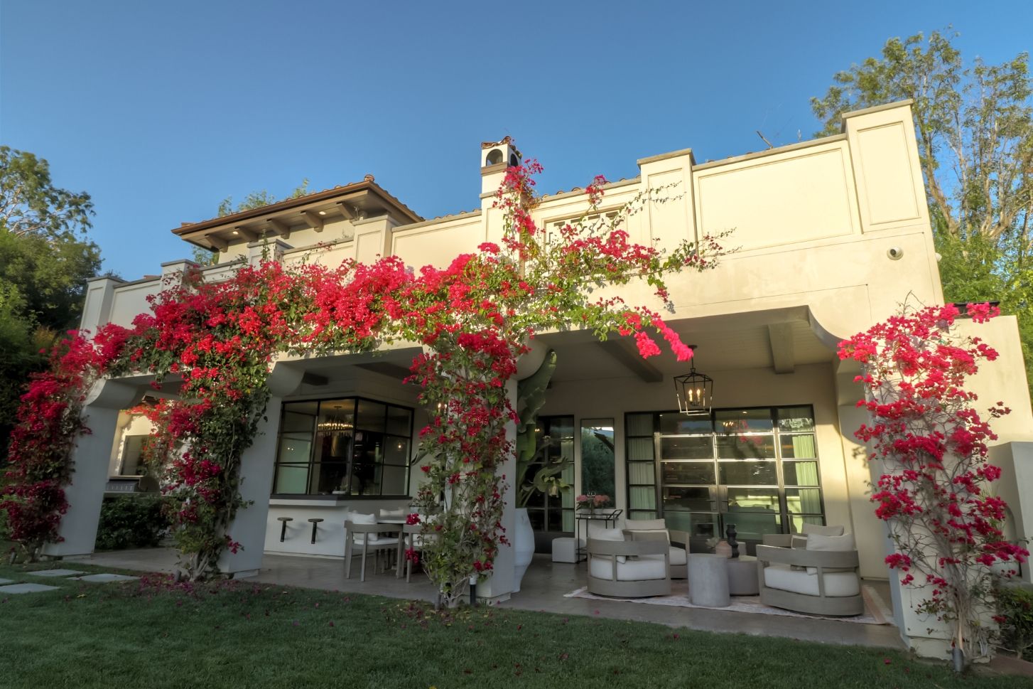
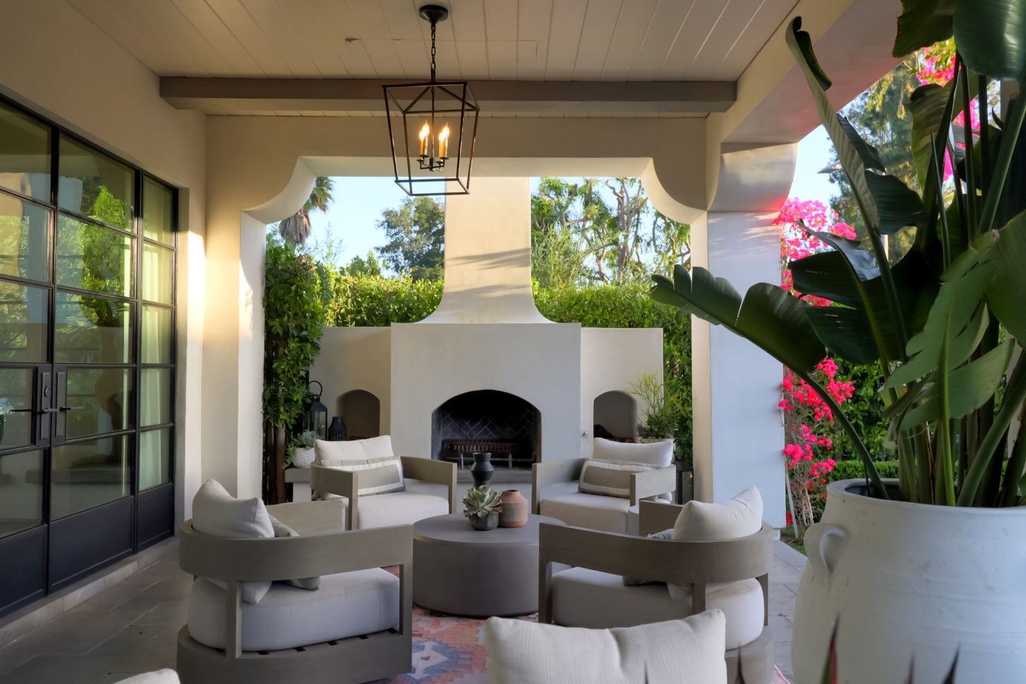
This project was to be the dream home of our client. They were sold on having the design be a contemporary take on the Montecito homes of Central California, which were inspired by the classic Spanish Colonial Revival style. The developer was familiar with completing more contemporary style flips but wanted to try something new and lacked a capable architect with the attention to detail that's necessary to capture the essence of this period. Upon seeing Glen’s initial sketch of their home, the owners were taken aback at how accurately he was able to capture what they were looking for.
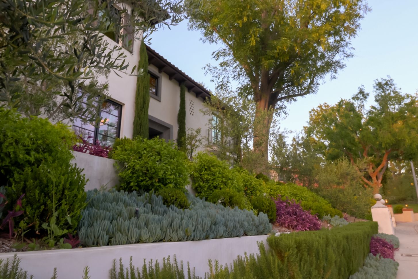
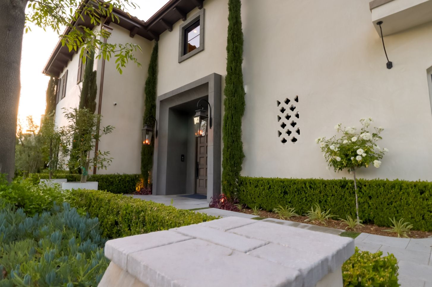
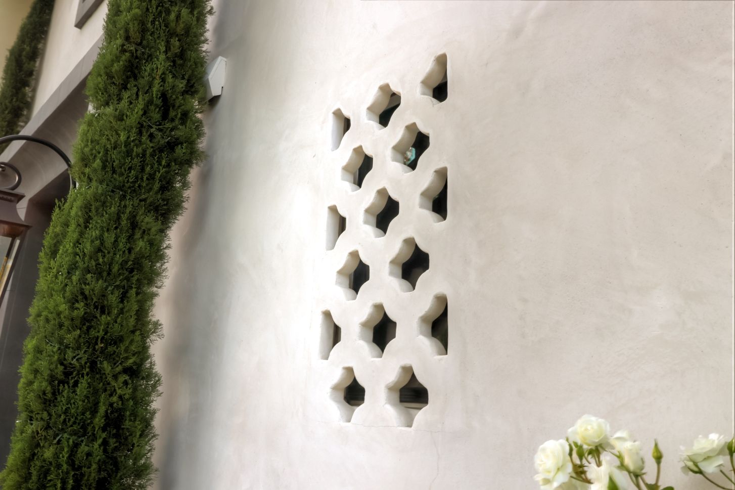
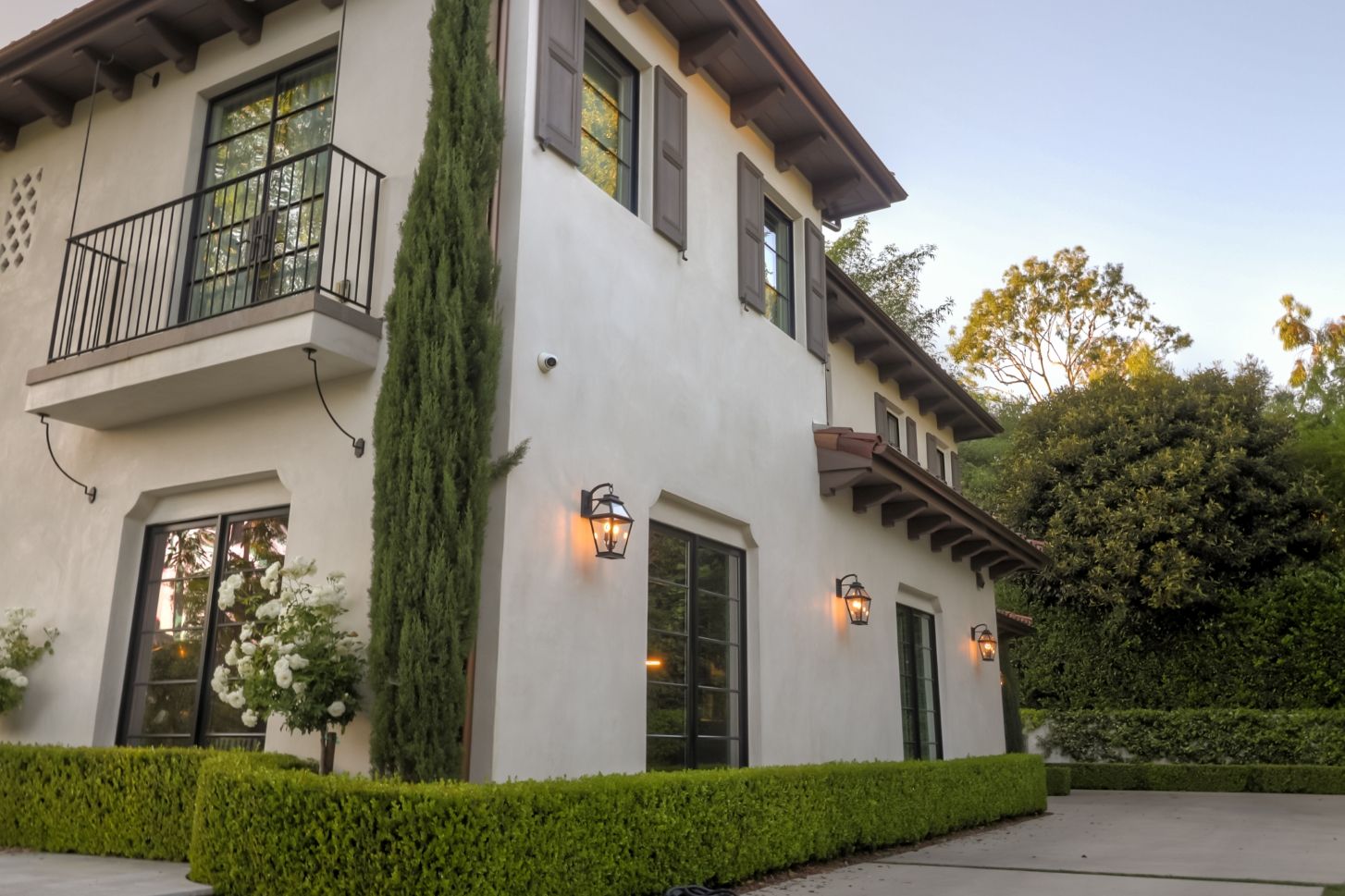
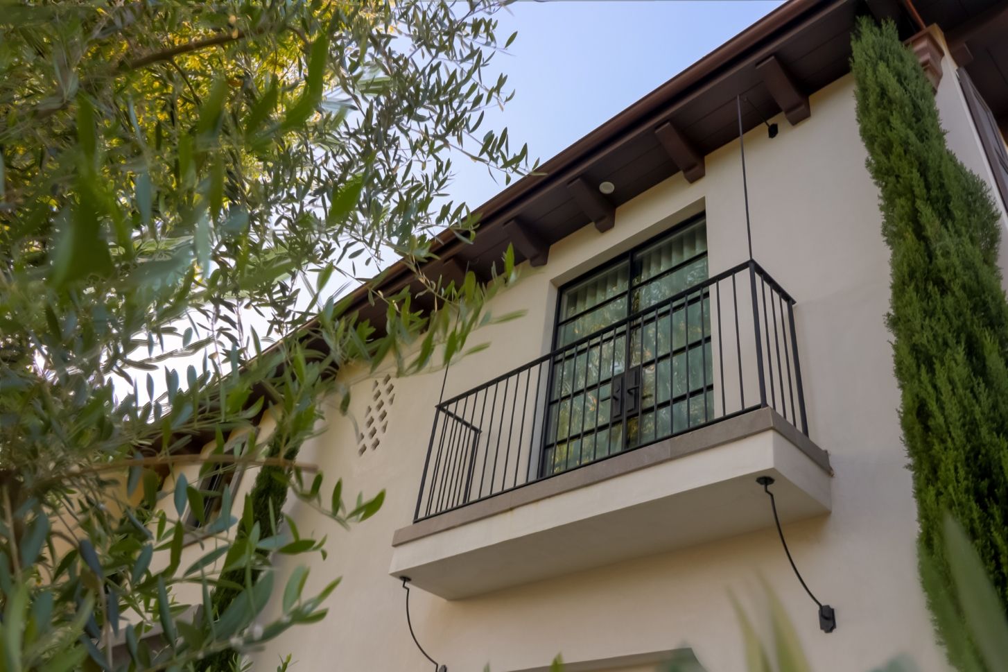
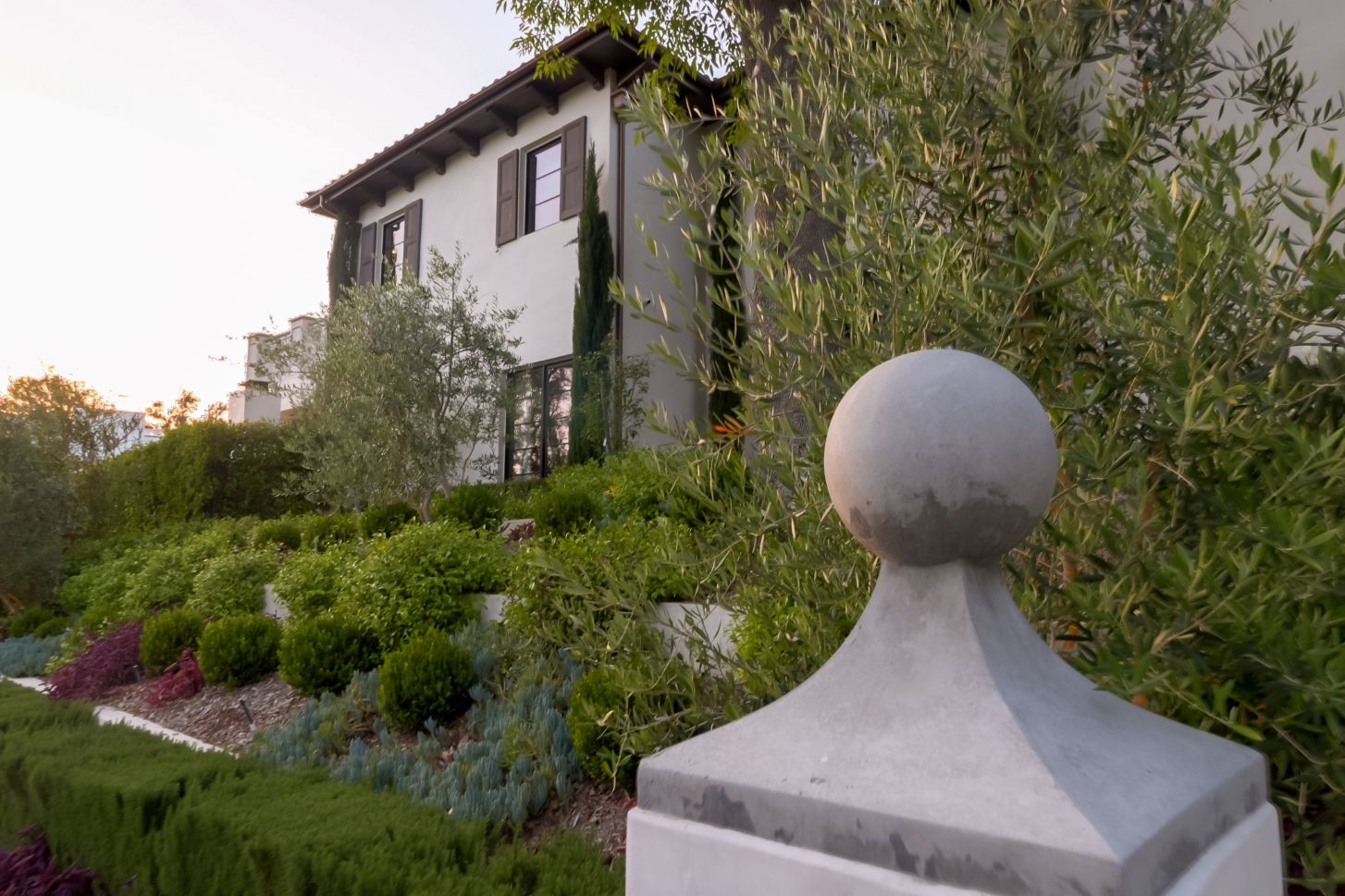
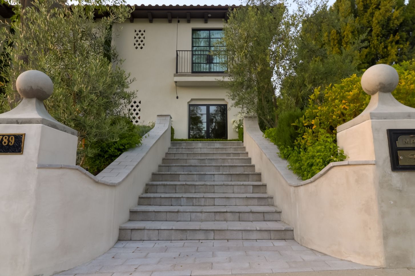
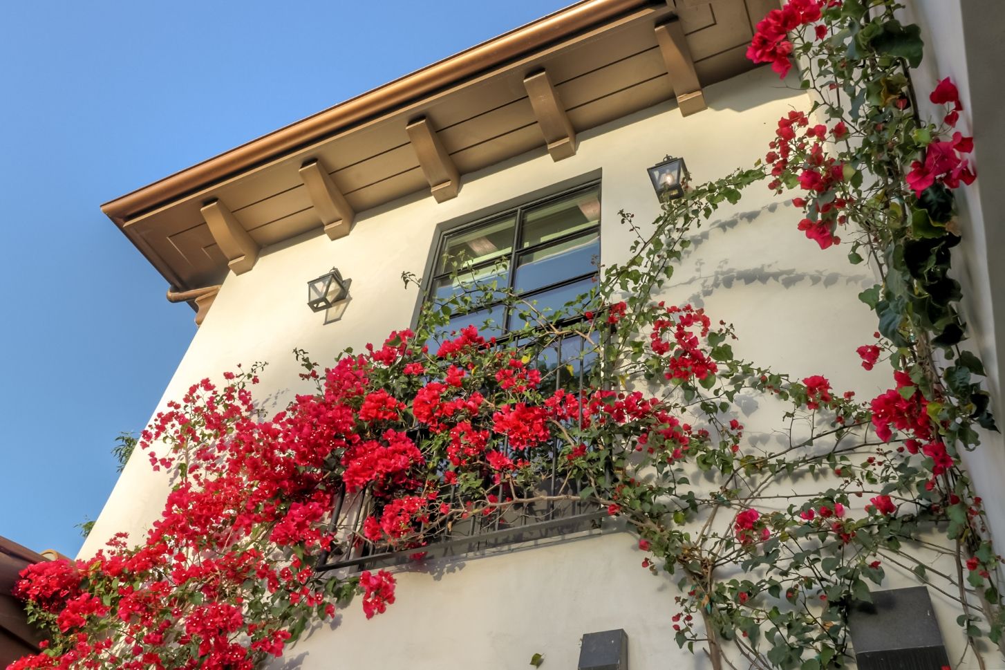
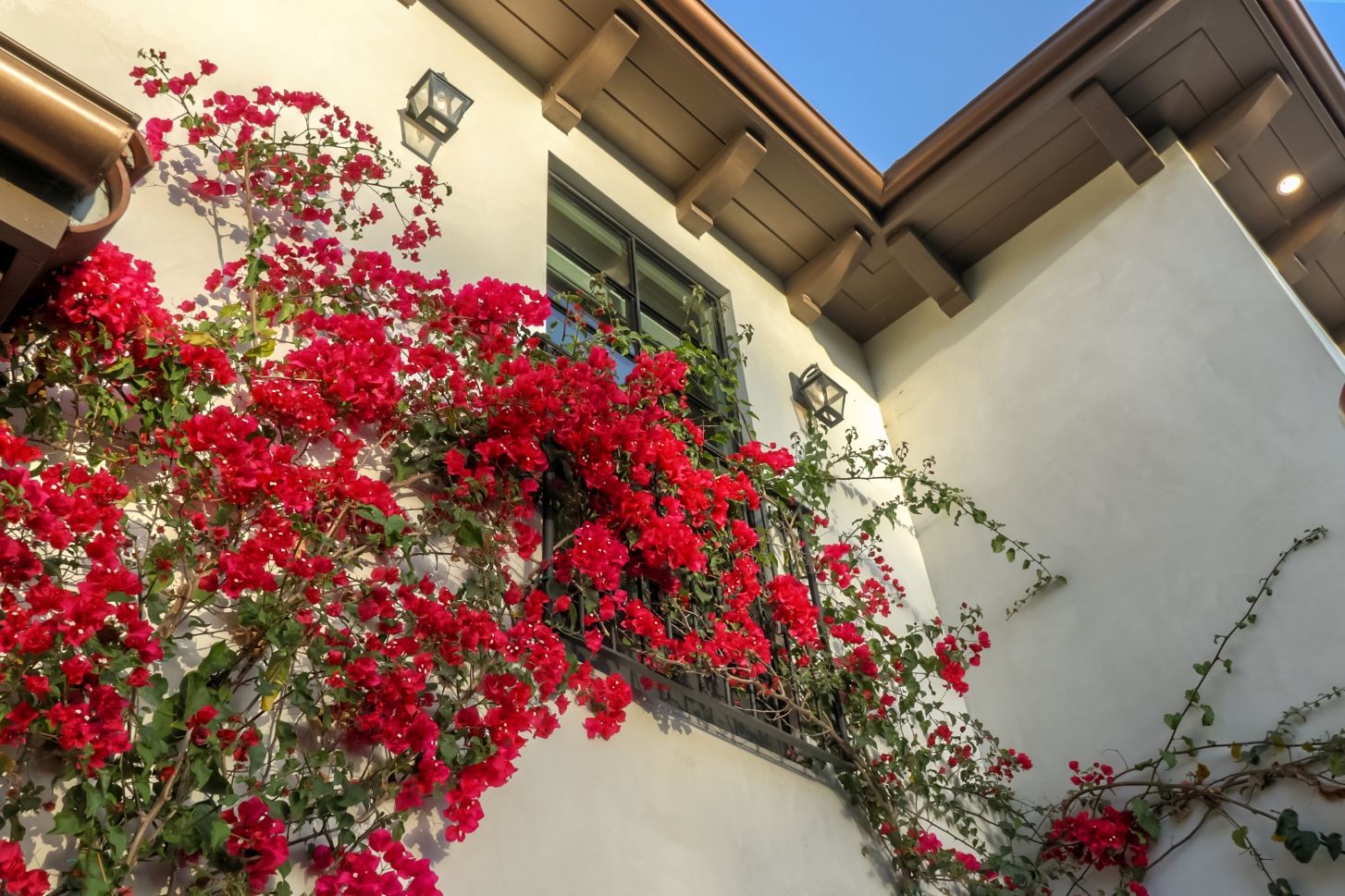
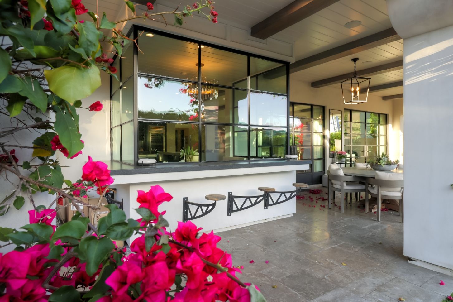
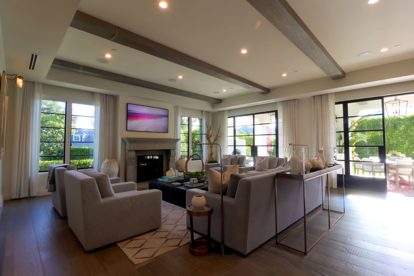
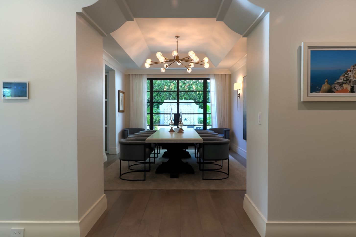
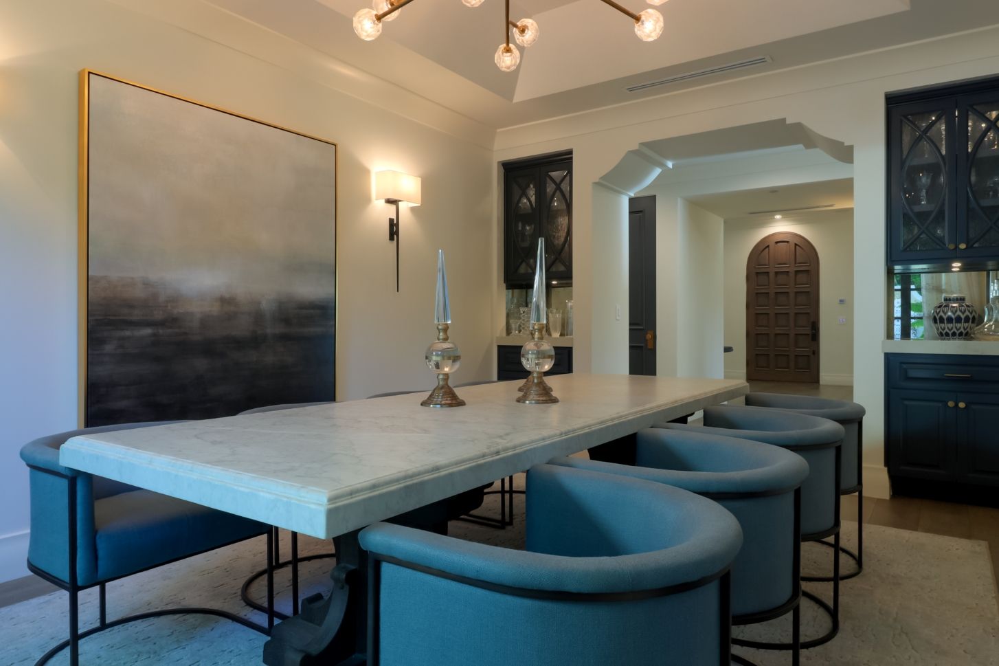
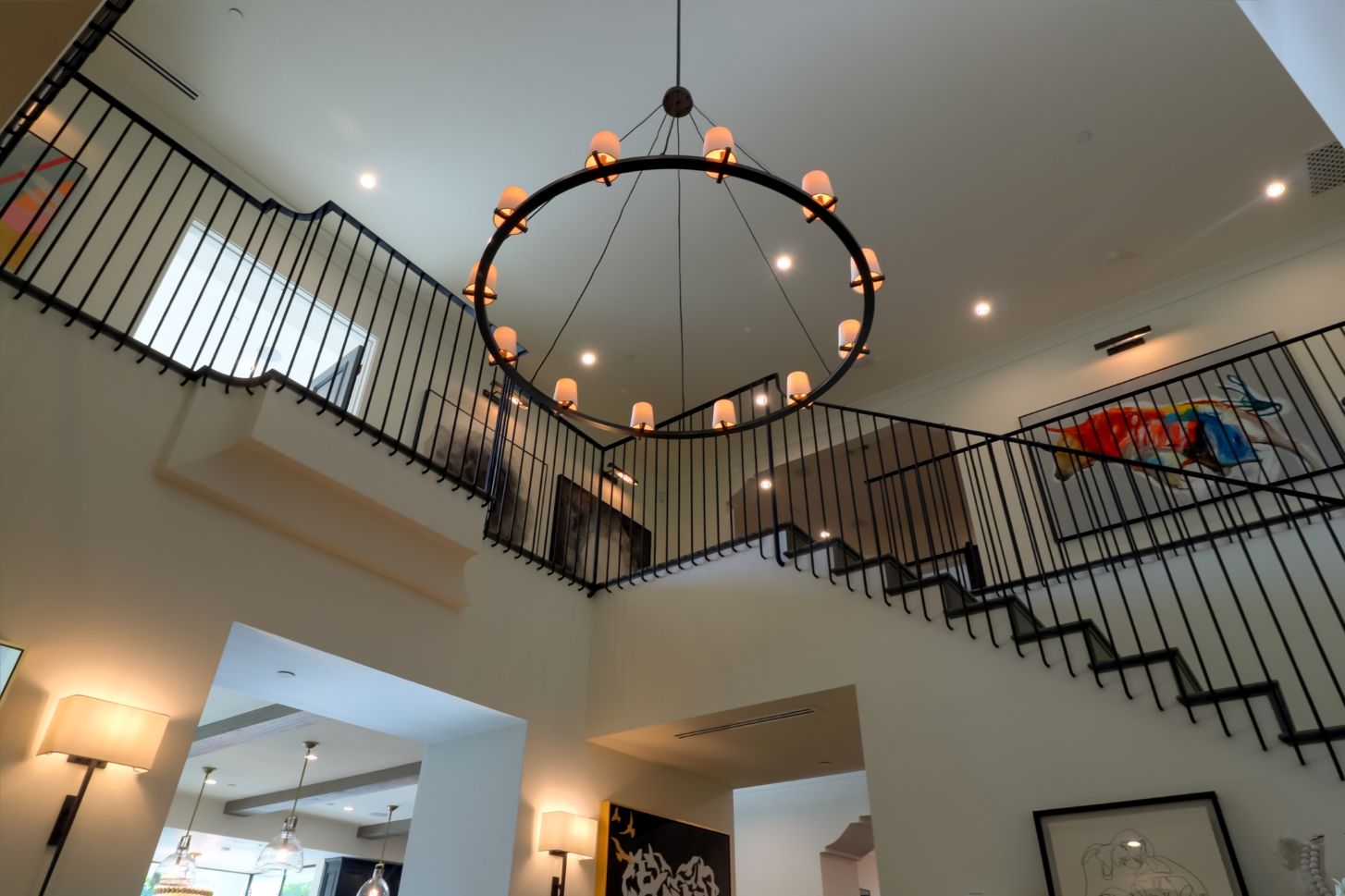
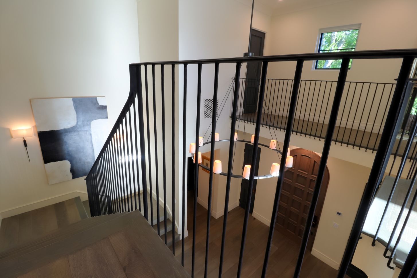
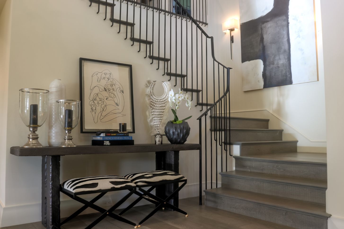
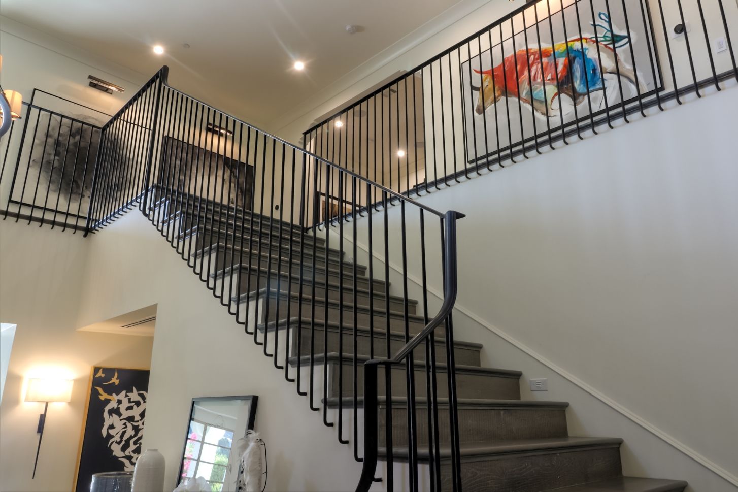
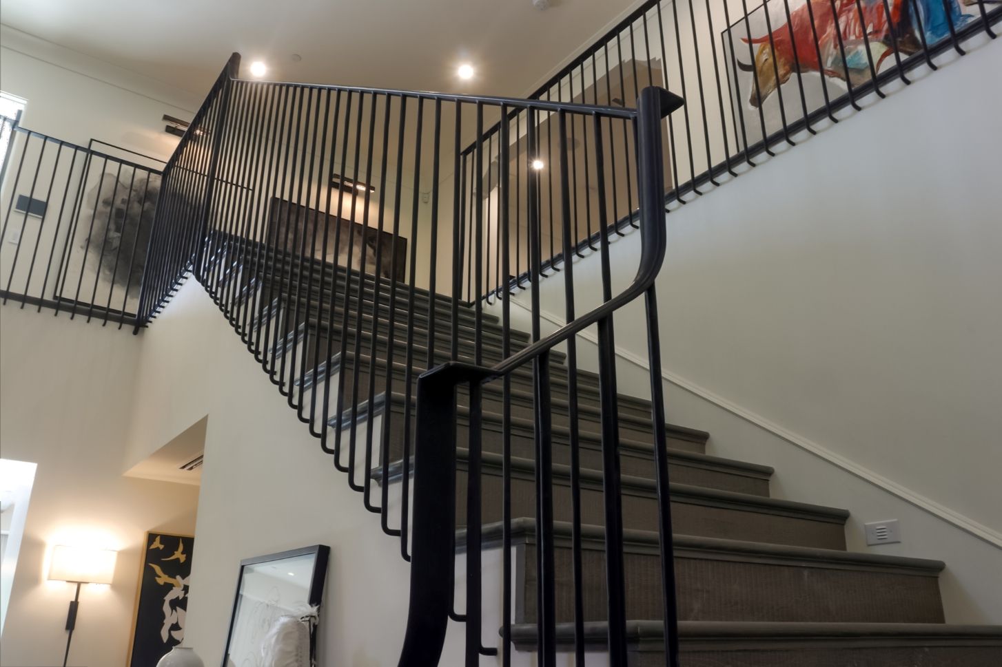
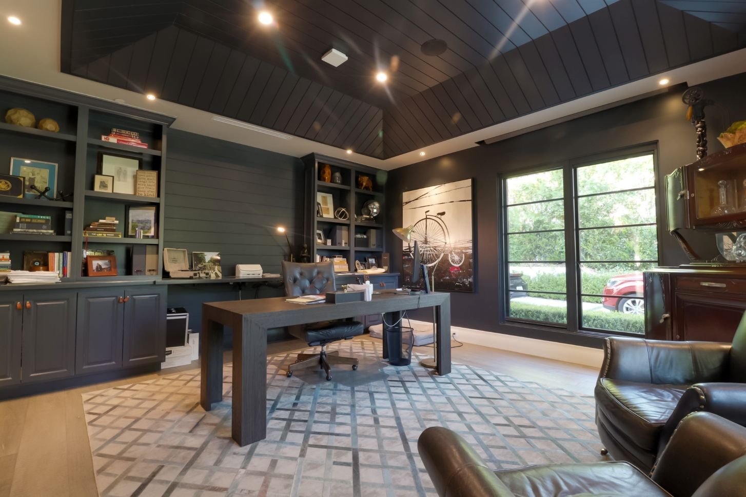
The original home was a single story California mid-century style made of mostly brick which we demolished down to one remaining wall. It was decided that in order to keep with the authentic Montecito style we would create a flat front façade with a small bump out. The entrance also had to be dominant and high which was helped by the new floor above. The new exterior includes off-white simple stucco that continues all around. In the stucco we designed pierced sections over the window openings that were emblematic of the period and an important detail of the style. The roof also included period correct stacking of Spanish clay tiles that gave it both authenticity and curb appeal. This was taken a step further when we designed authentic eaves that have corbels spaced exactly twenty four inches apart, exactly how it would have been done in the authentic style. Our goal with the interior was to authenticate the flow of a traditional layout rather than the more common open floor plan. As you enter you’re met with the formal foyer and grand staircase with high ceilings above. A series of beautifully carved openings then lead you to other important rooms, the carvings help to indicate to guests the importance of each space as we can see from the opening to the dining room. This was rooted in the period correct approach of highlighting important spaces with intentional detailing. This is contrasted by the great room on the other side which was purposefully more subdued. The adjacent wall almost disappears into a vestibule which leads to the clients office. The guest room is tucked away in the back behind the stairs for maximum privacy. On the second floor we designed a new master suite bathroom which had period authentic steel doors. We also added the authentic iron guard rails but kept them more simple than the frilly, decorative style you typically see in Montecito homes. We wanted to keep all the metal work, including the false balconies, simple and clean.
