The Cyclist
Reseda, CA
The Story
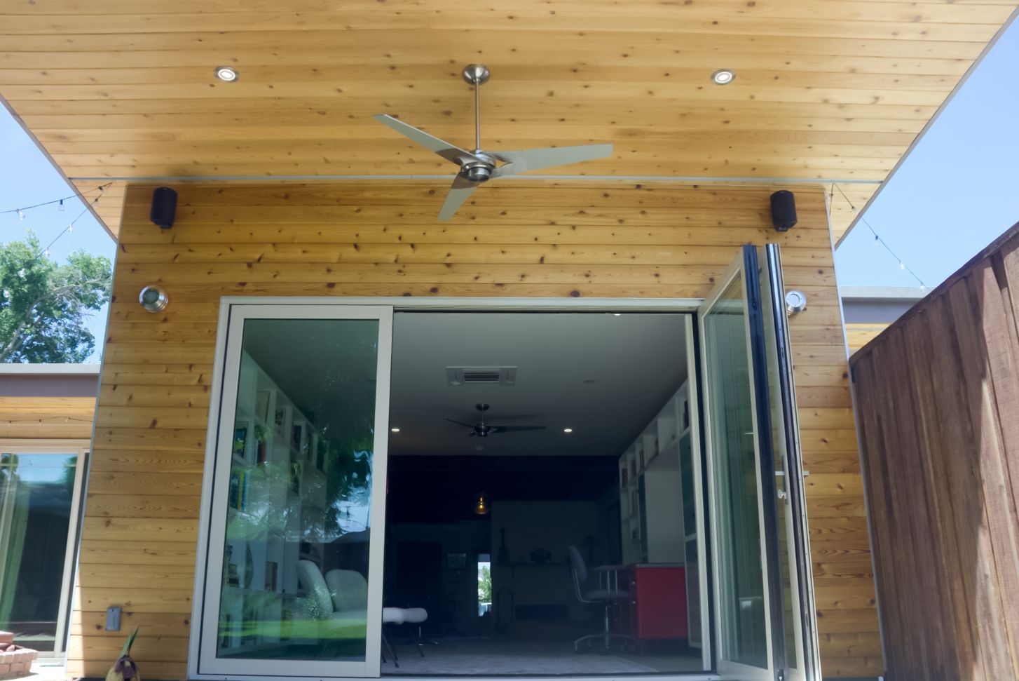
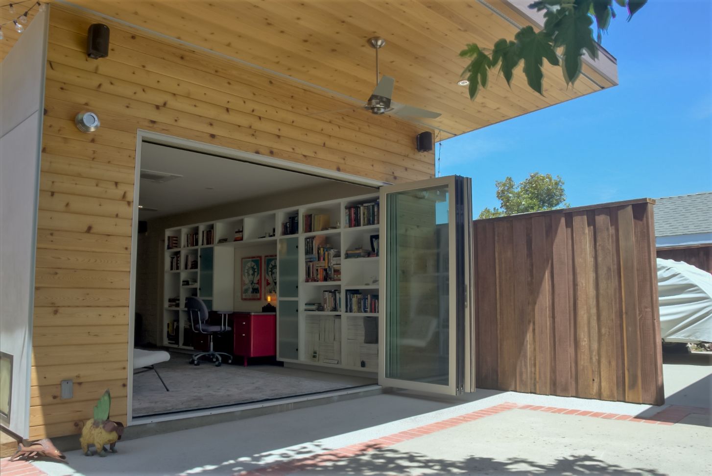
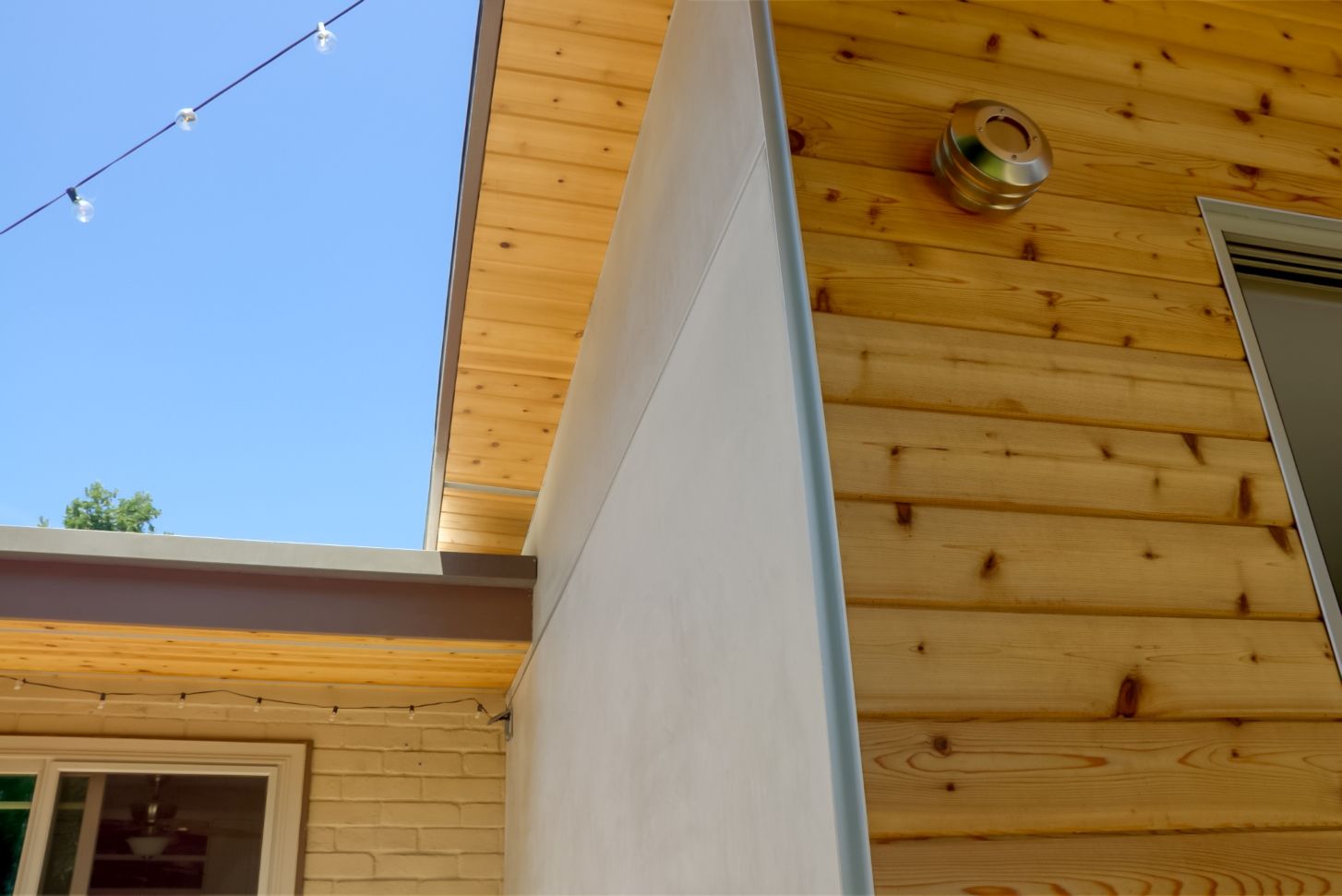
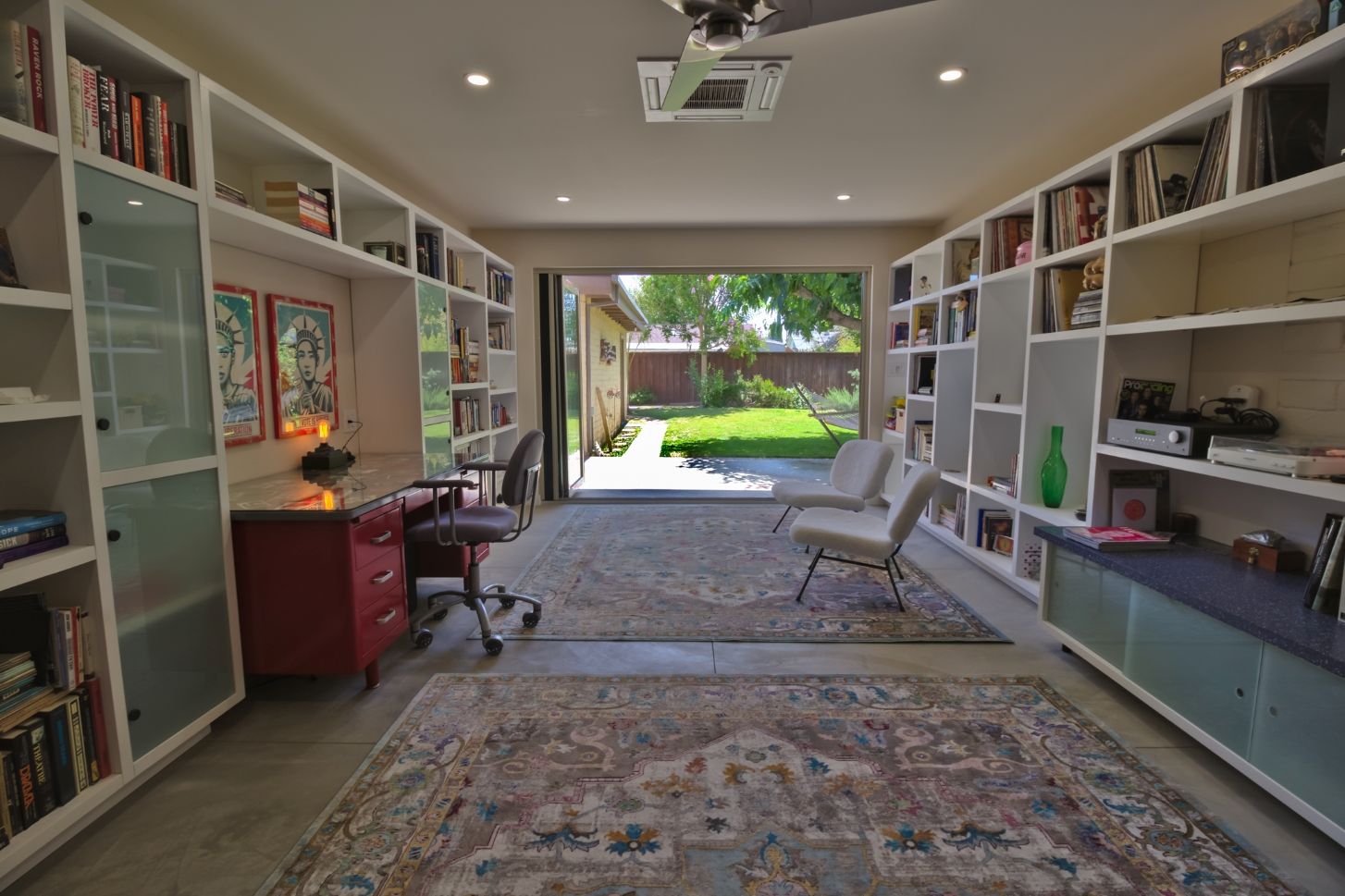
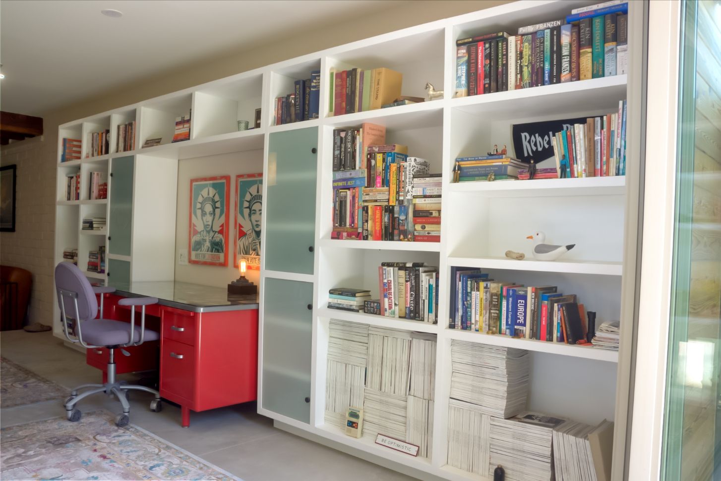
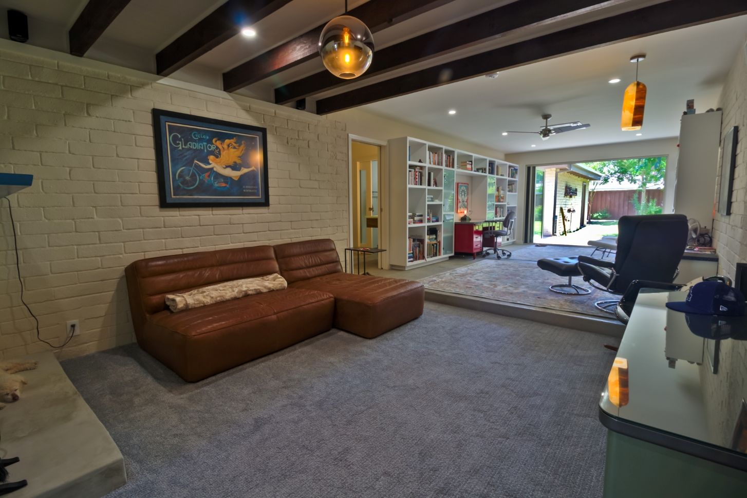
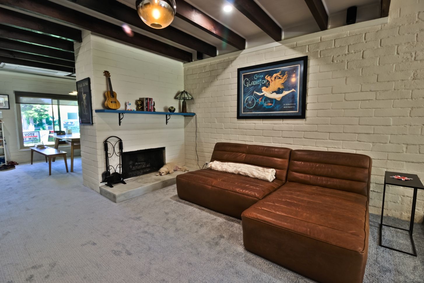
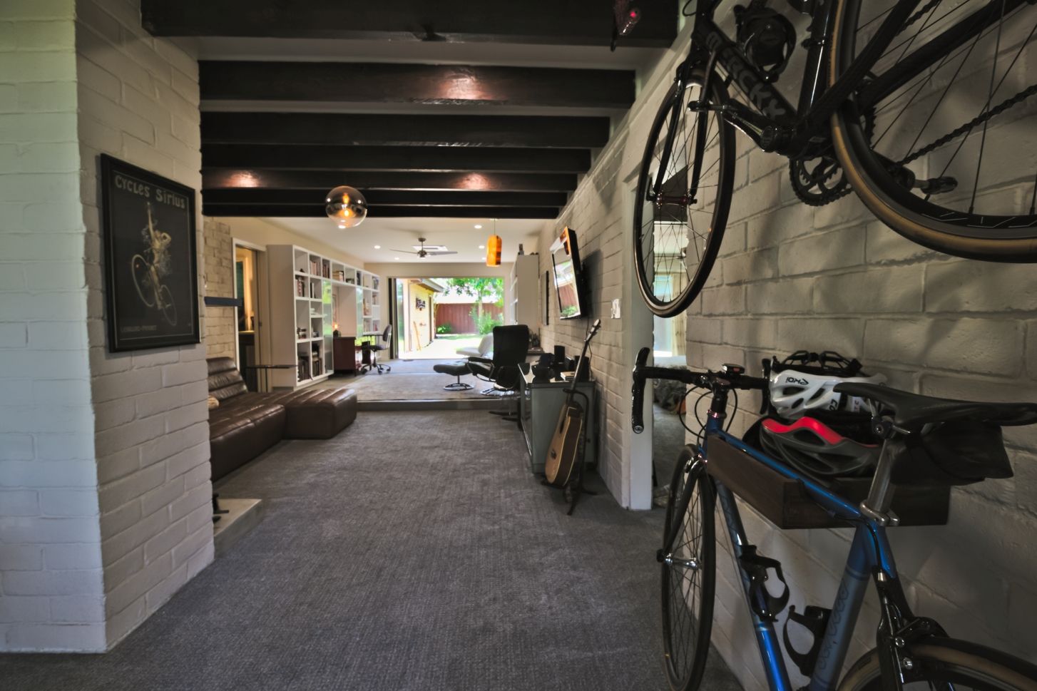
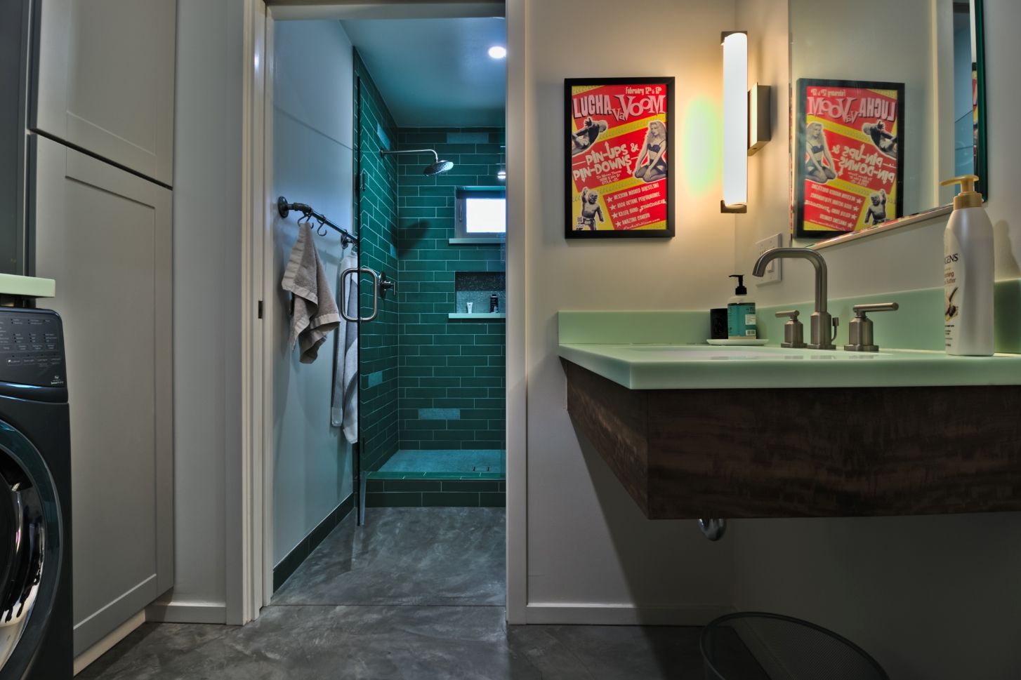
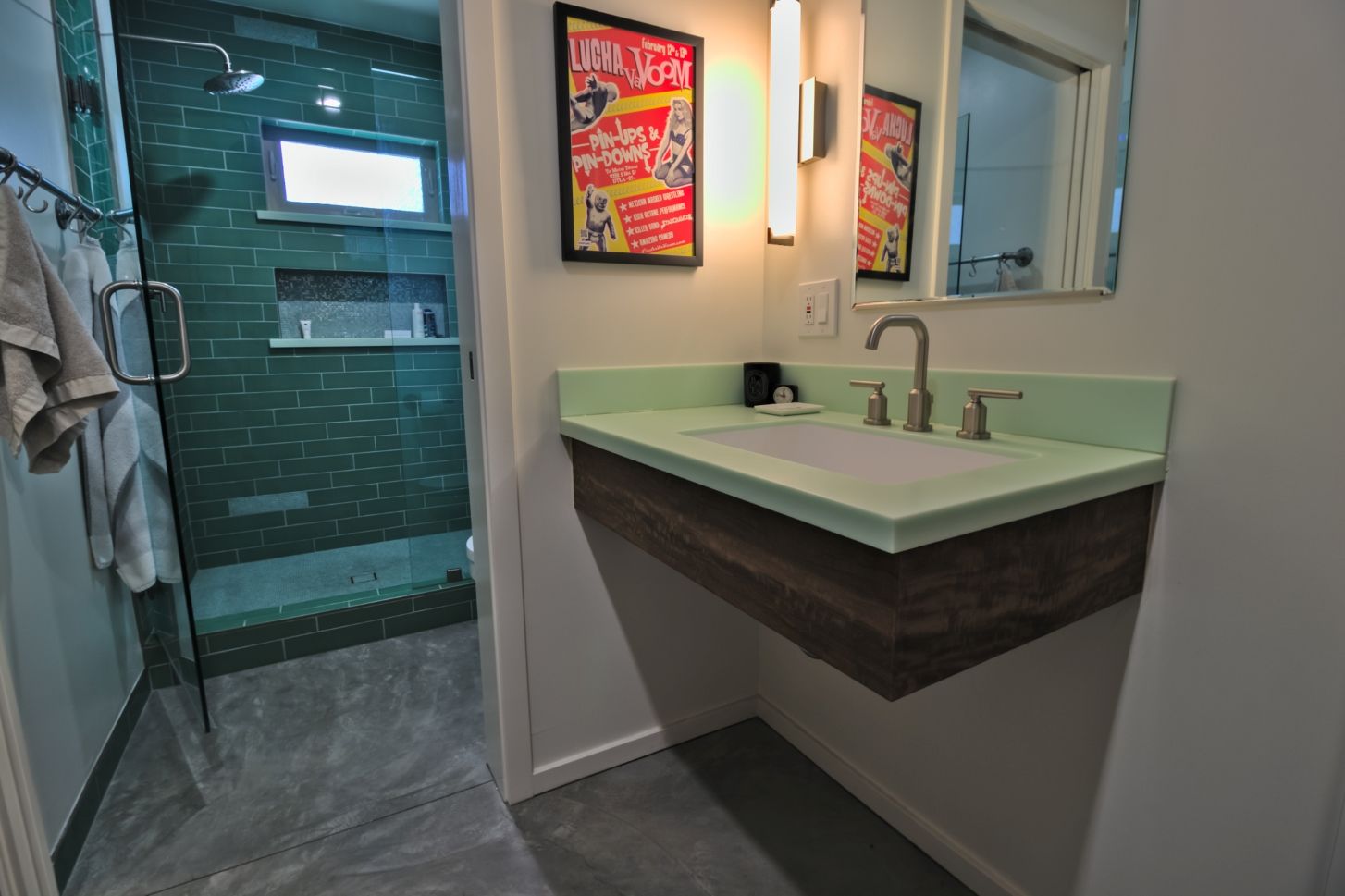
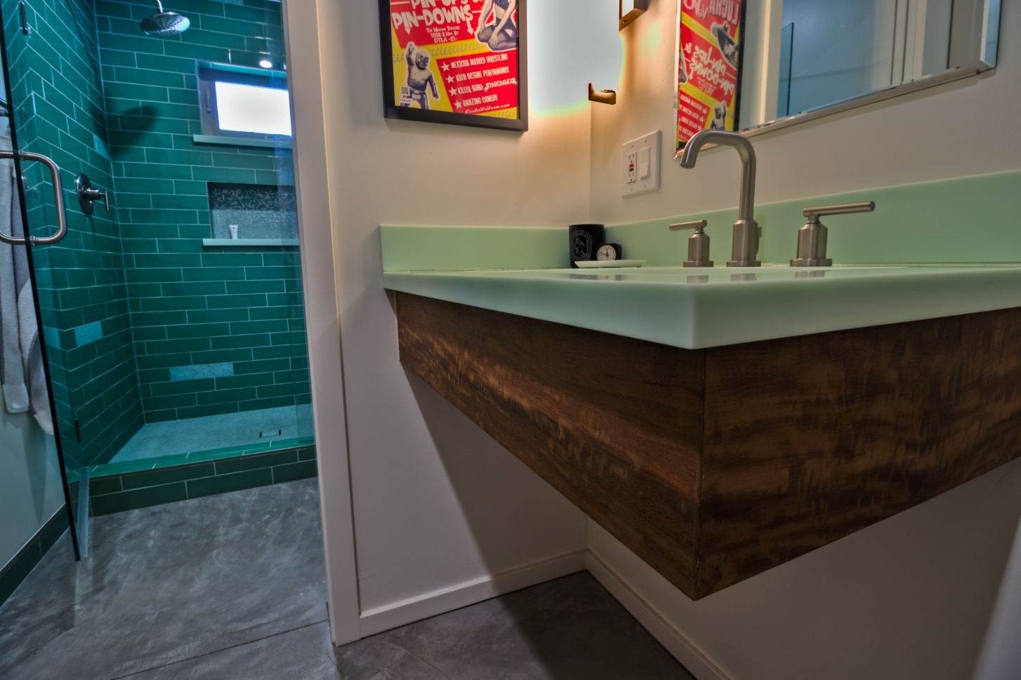
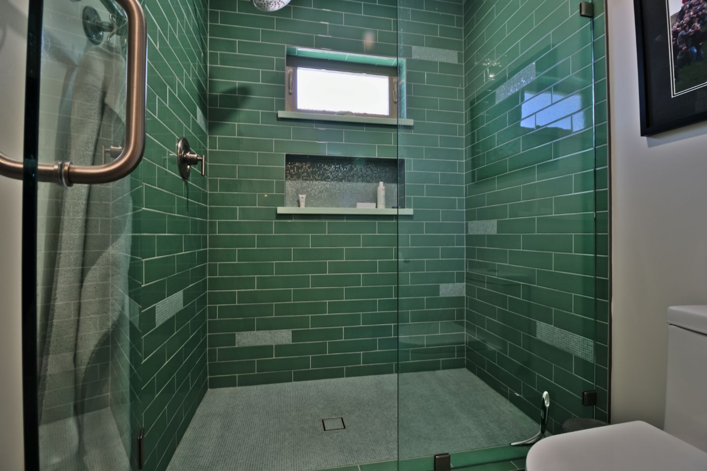
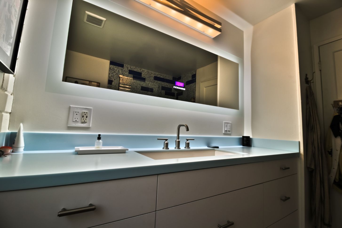
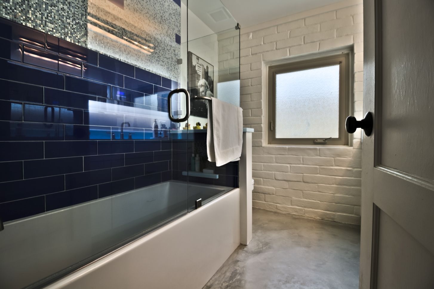
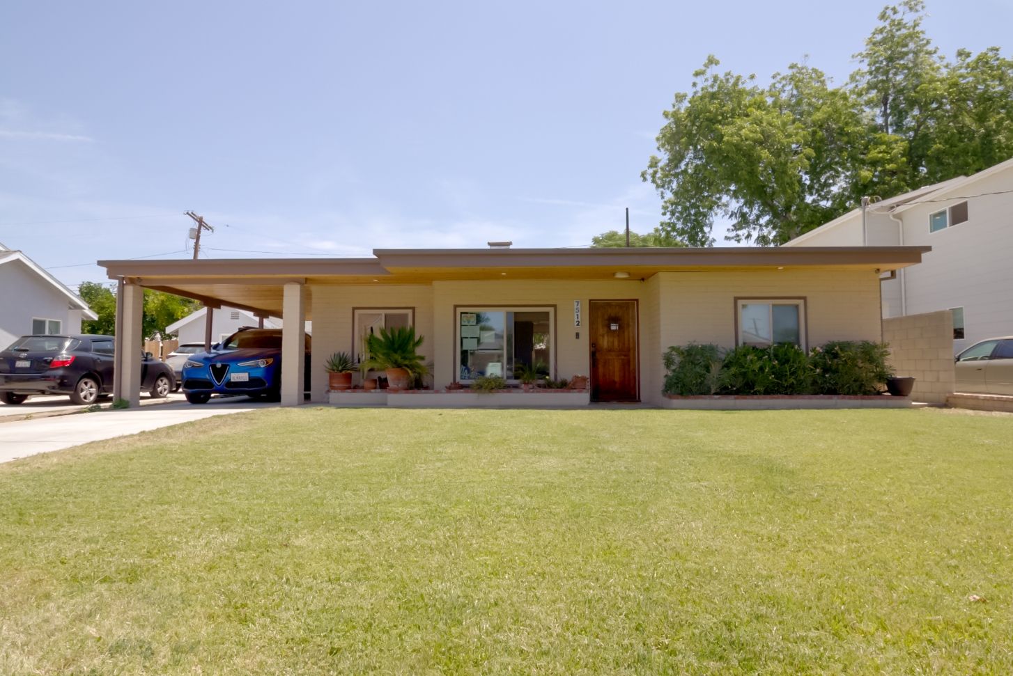
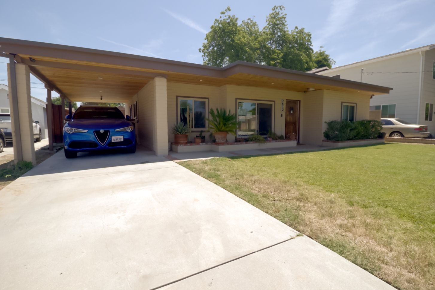
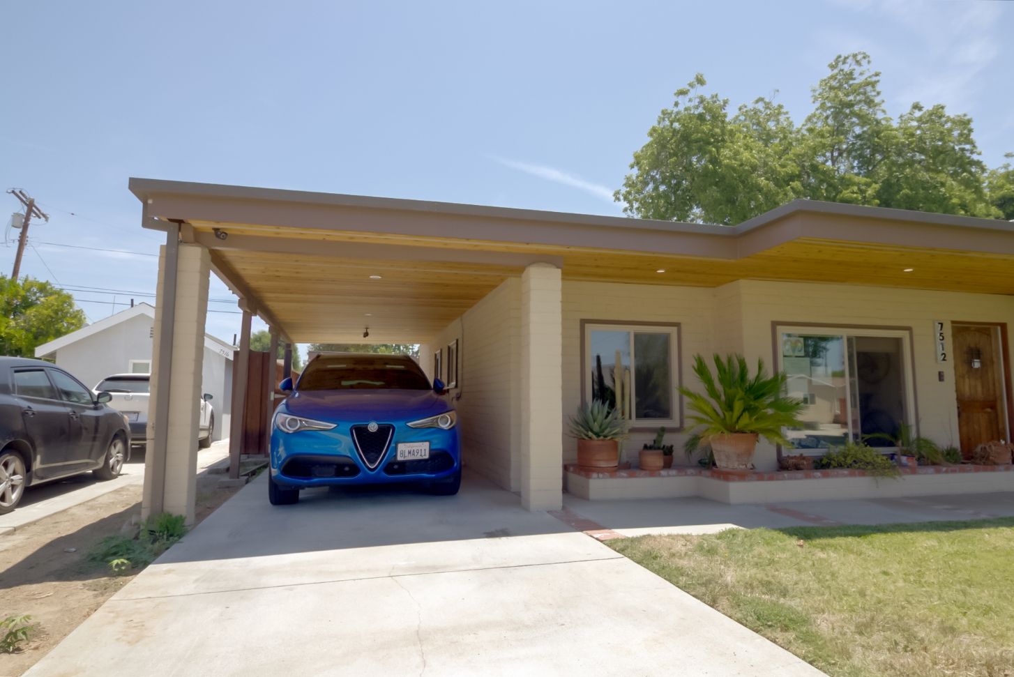
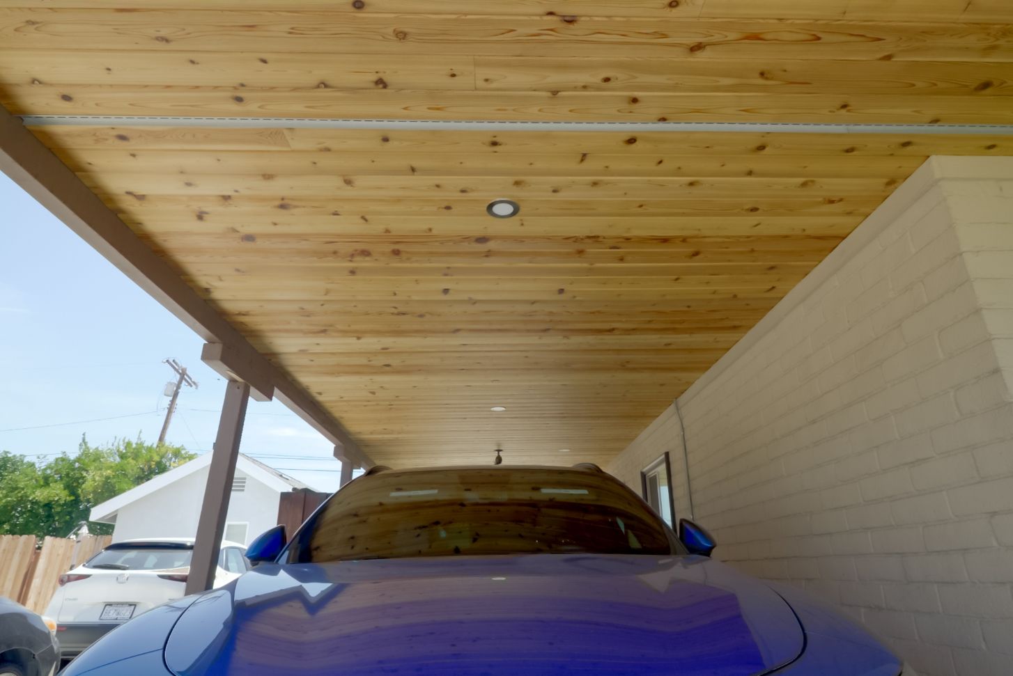
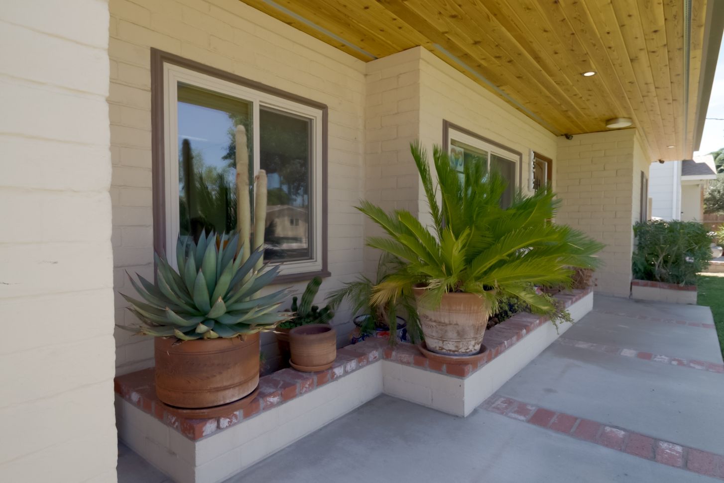
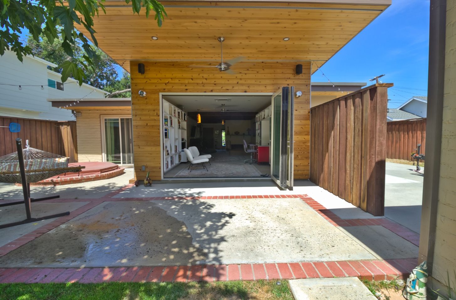
Our client for this property was looking to update their home while keeping the original Mid-Century architecture intact. The primary scope for this project was to design an opening to the backyard, which also functioned as an appealing indoor-outdoor space. Interestingly, the original home was partially constructed of masonry rather than the traditional wood frame commonly seen throughout the valley. While this is great for the frequent hot weather, it gave us a challenge in designing our addition. We would have to choose to either blend the existing architecture or to design something that complimented it. It was decided that we would steer away from blending it and instead create a feature with a slight flair but mostly subdued, as to not overpower the existing architecture. We purposefully shaved the roof up in our designs to create a “flying moment” as seen in some of our other projects. The intent in creating this lift was to provide shade and to be a continuation of her living area, bringing the two spaces together. This also helped it to differentiate from the traditional hip roof and flat roof systems that are more common. We brought in wood to the exterior as a prominent feature to maintain the home's warmth while not looking out of place. On the interior we redesigned the bathrooms and laundry as well as created new shelving in the living area. We provided proper detailing, spatial sequence and worked with the clients budget to create something that flowed well and carried the same warmth as its owners.

