The Modern Barn
Agoura Hills, CA
The Story
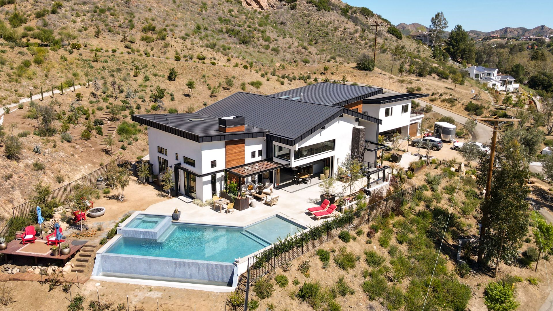
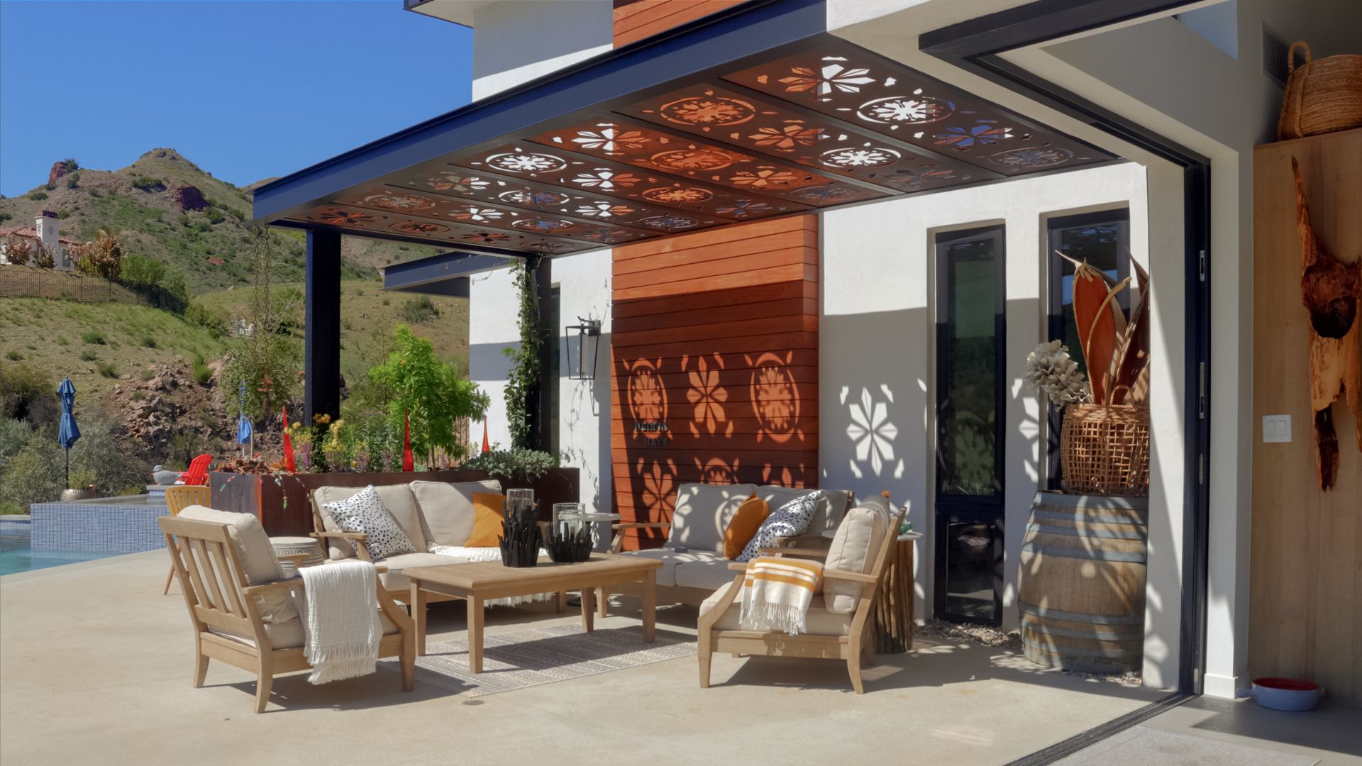
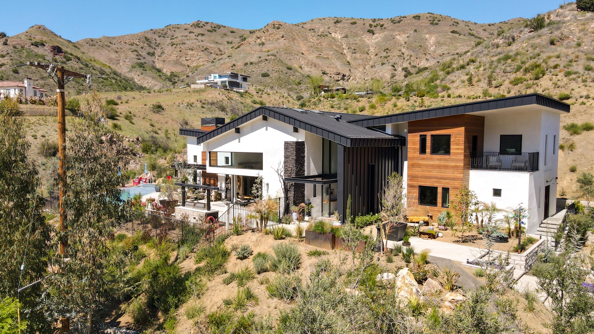
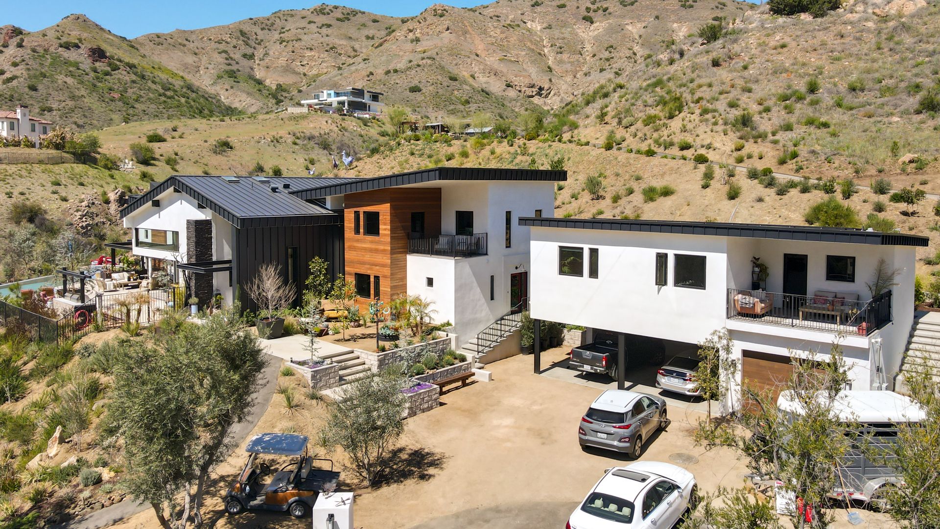
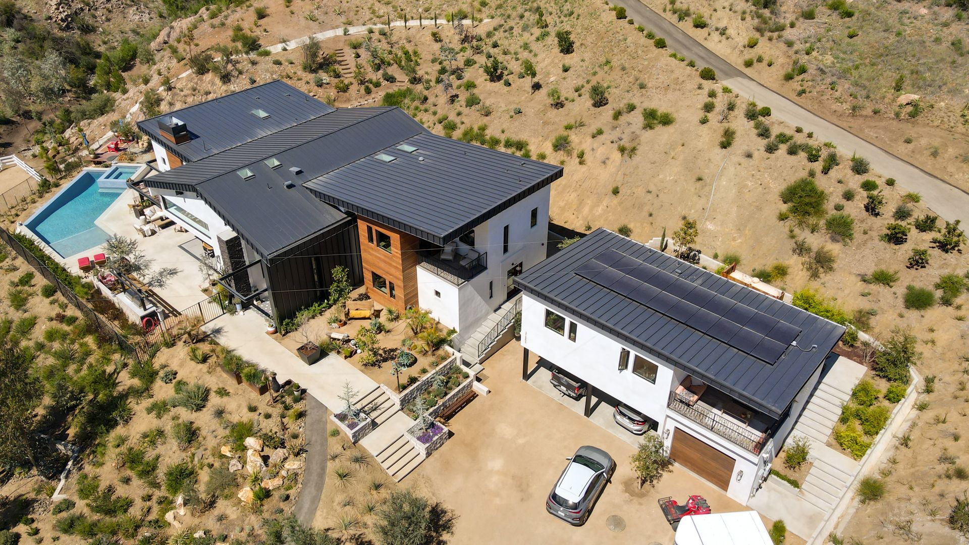
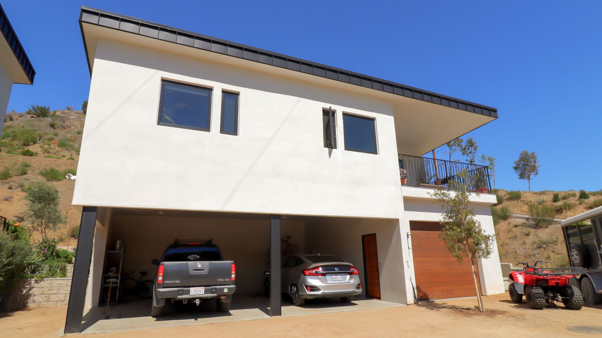
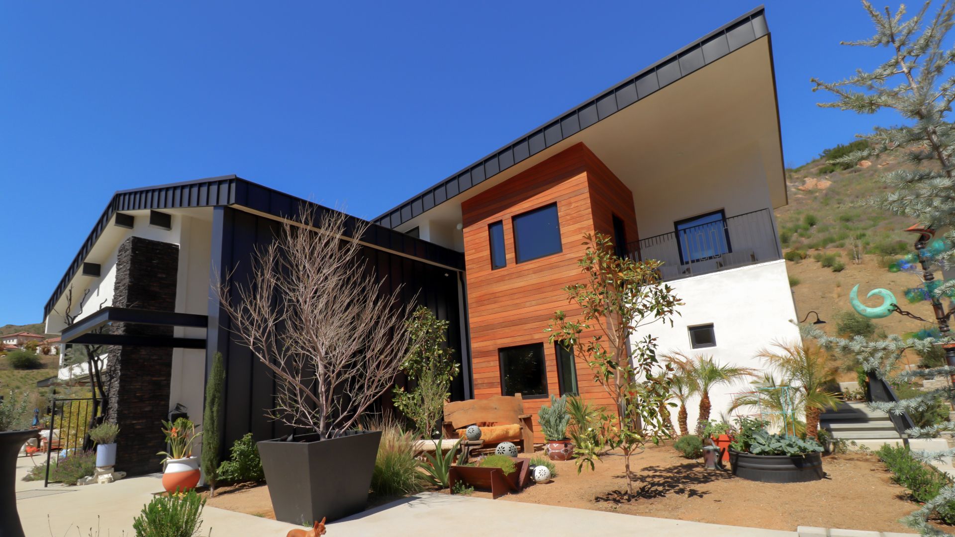
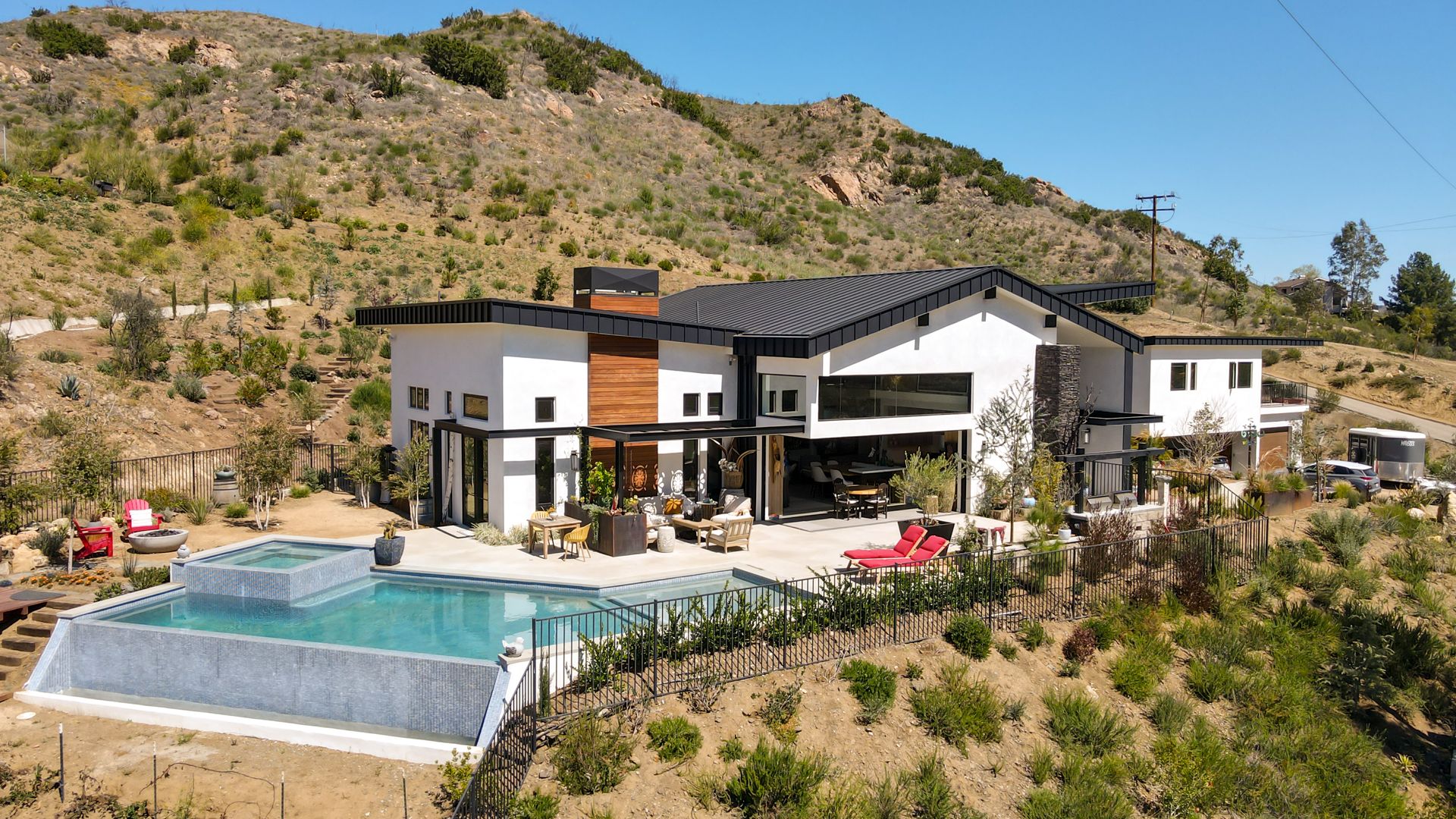
Our client for this property came to us because their original architect wasn’t able to capture the design they were imagining. They were looking for something that was more contemporary but were receiving more traditional designs from their previous architect. What our client really wanted was a transitional take on the farmhouse style. For this project we were looking at designing ground up construction of a 4,500 S.F. home. Our goal was to create something that sits within the landscape and takes advantage of the mountainous views of the valley they were in. For us, it was important that our focus was on placing the home on the site in an appealing fashion rather than blending it to the landscape like we’ve done in previous work. The lot itself is placed against an upslope with beautiful views to the south. We wanted the home to feel as if it was perched, similar to a bird, on their lot overlooking the beautiful mountain range. Inspired by this, we became interested in designing something with wings so that the home feels as if it’s landed in the placement that it’s in. When looking at the architecture you can see that the main bay has a gabled roof that juts out on either side similar to a set of wings. The pediment we designed kept with our farmhouse style while also including a more contemporary concept of “wings lifting off.” The black metal roof accompanied with fire rated wood paneling and stucco not only provides fire safety measures for the high fire zone they’re in, but it also creates a nice composition of materials that breaks up the massing in an appealing way while also providing a contemporary feel.
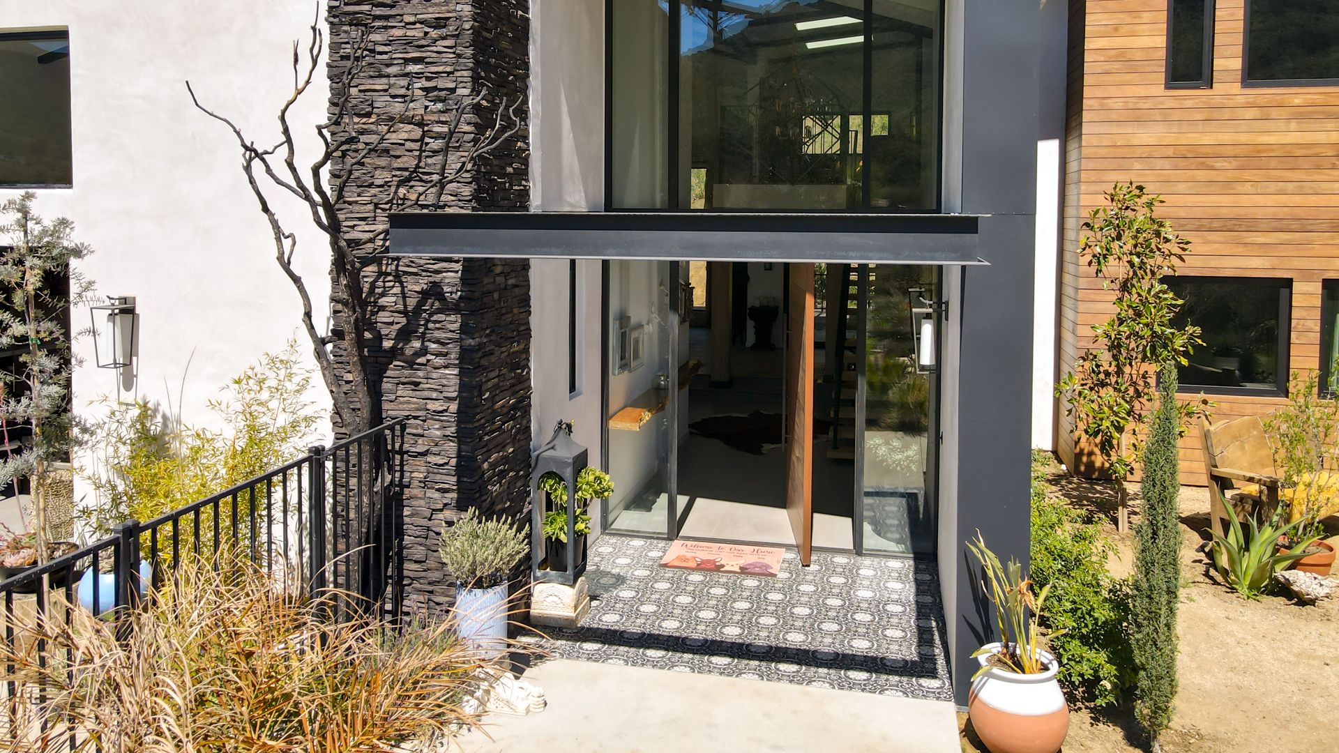
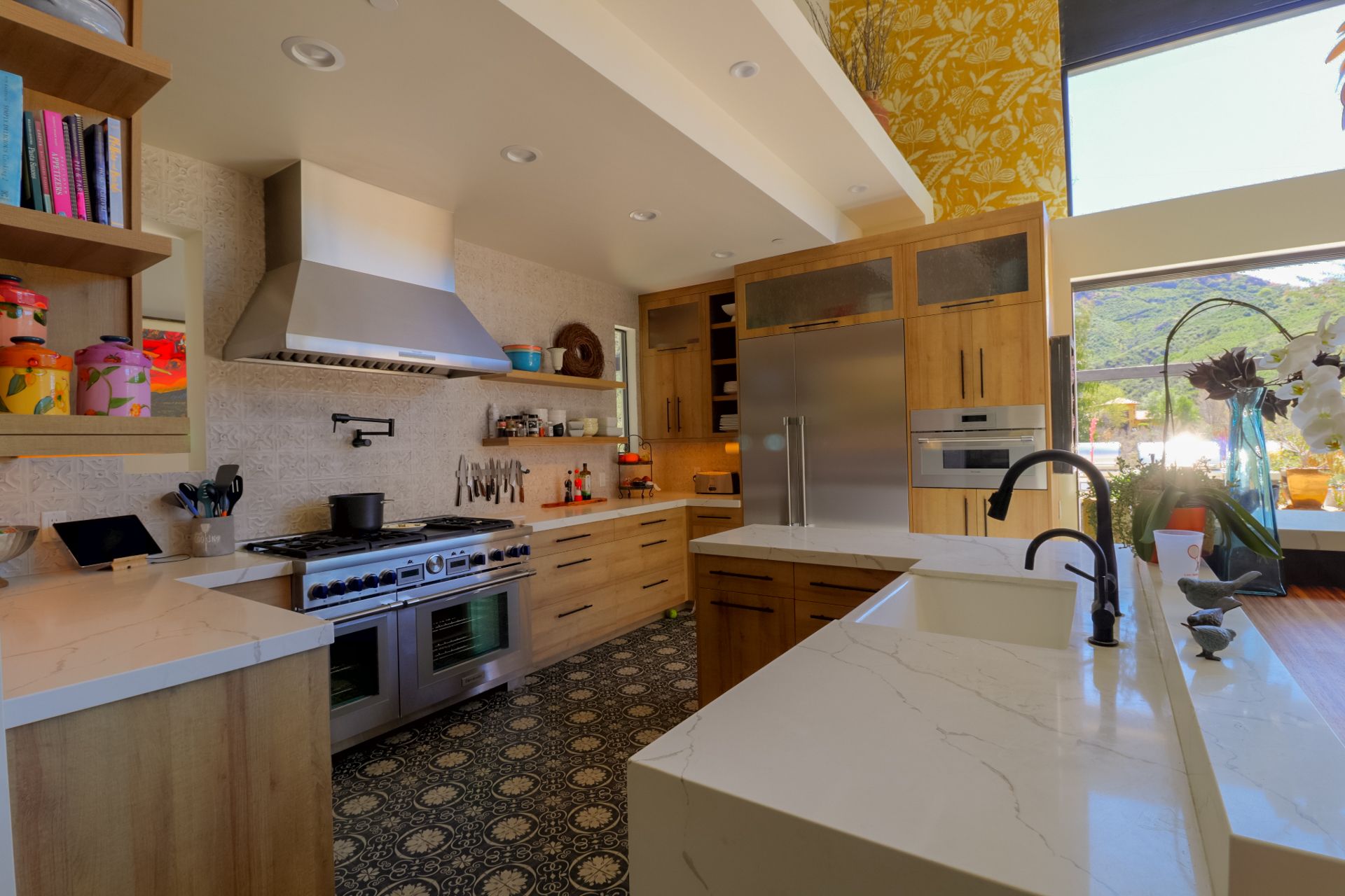
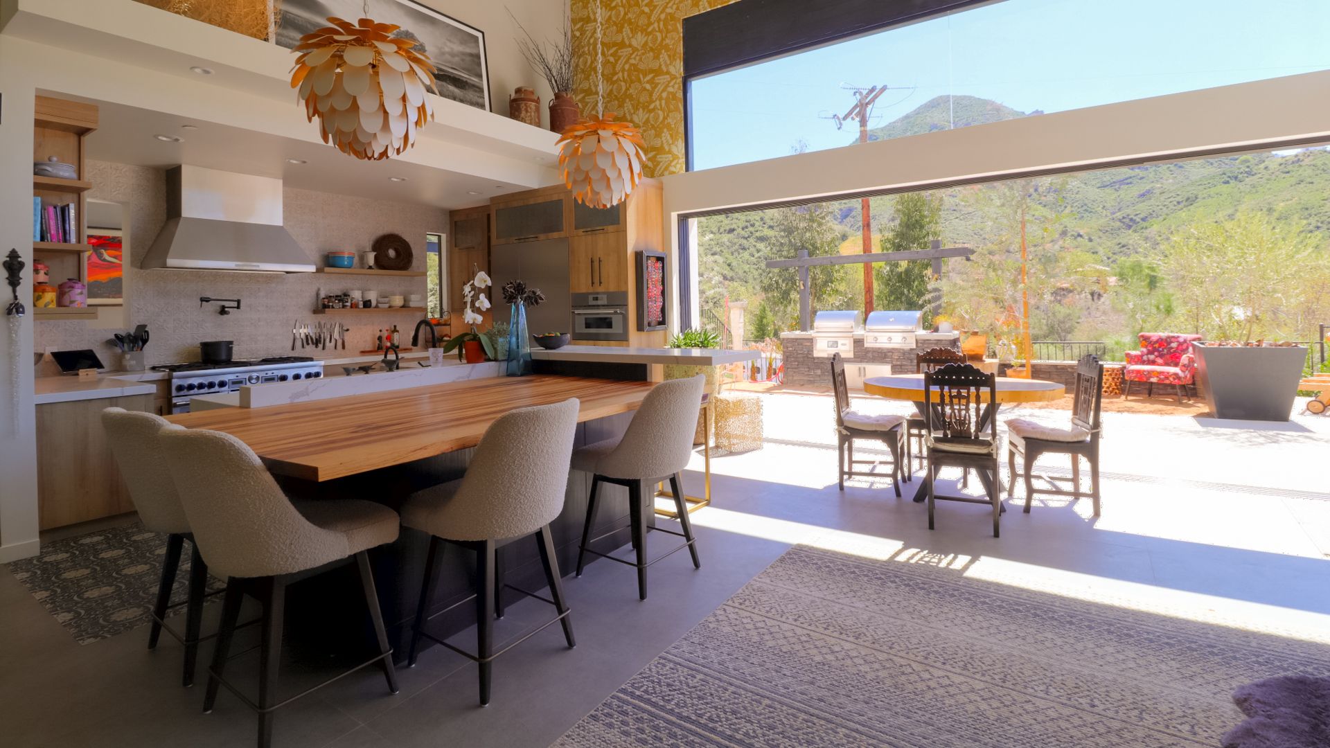
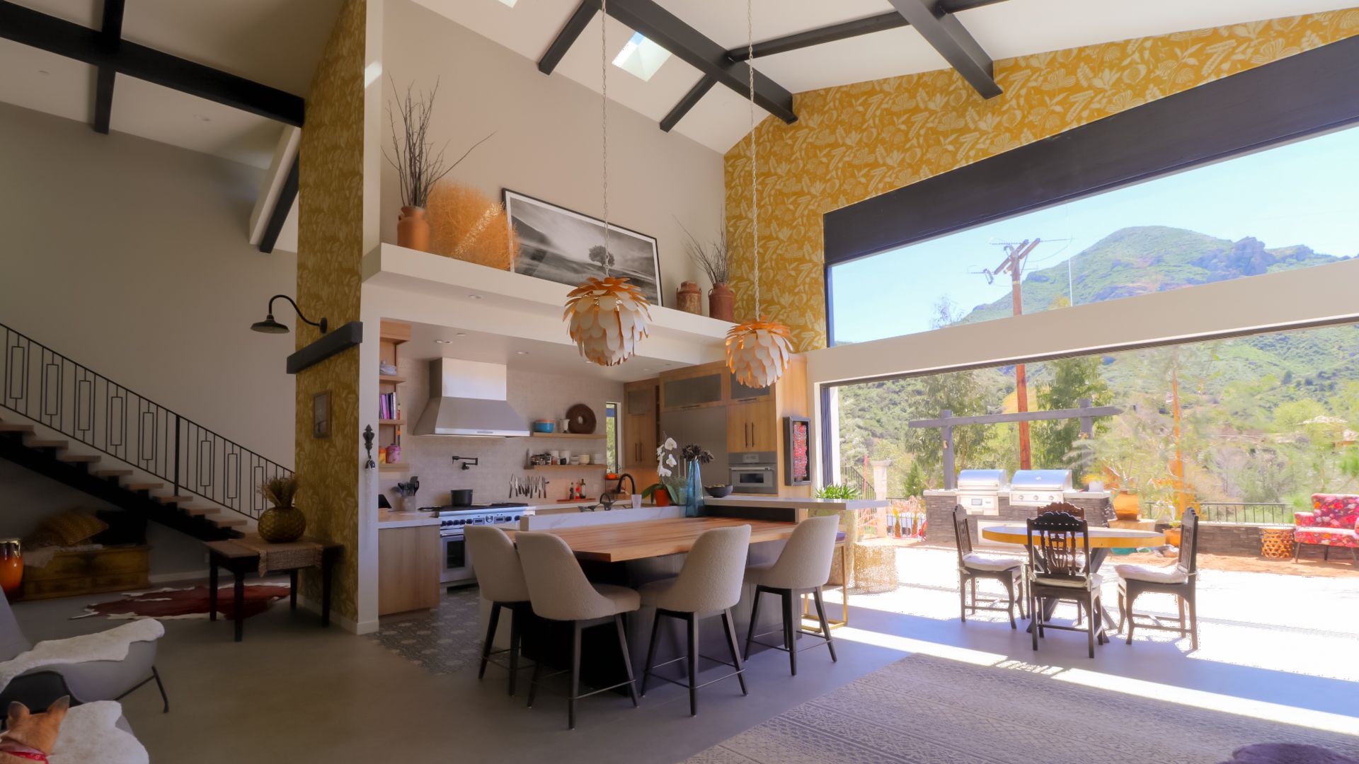
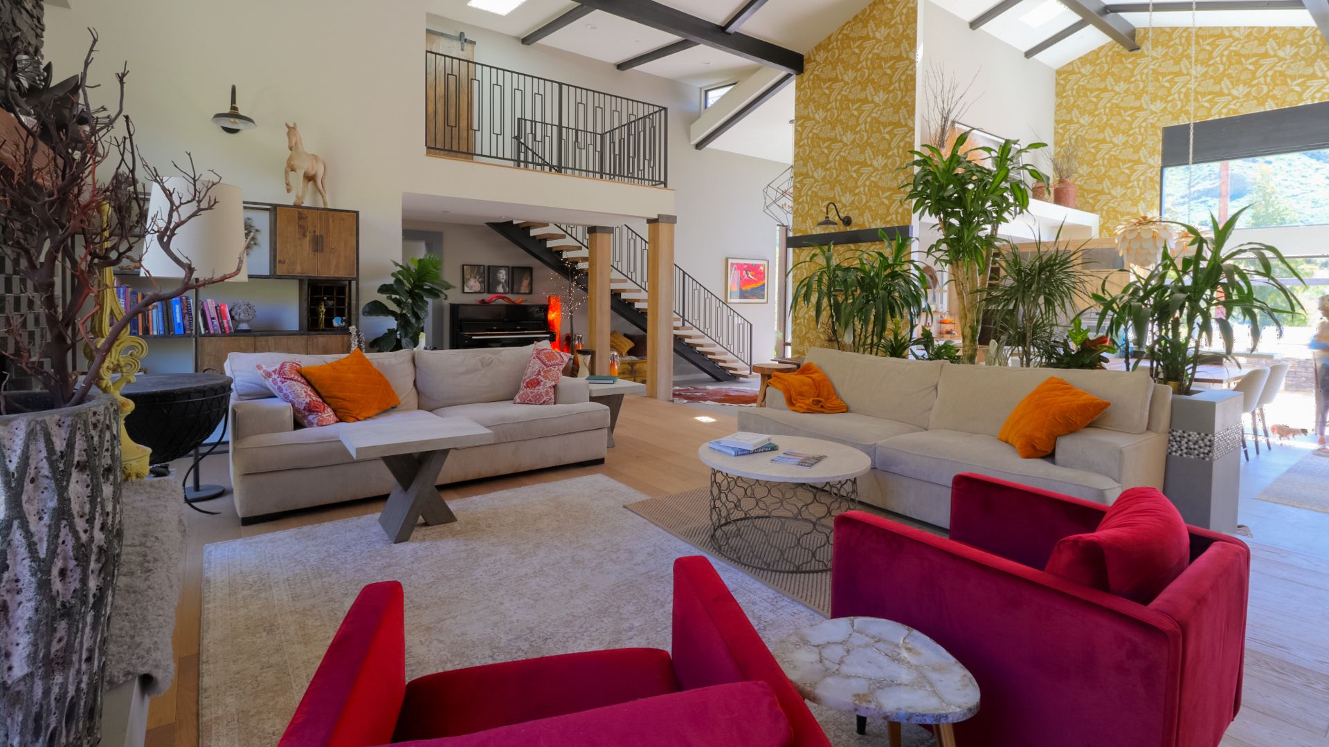
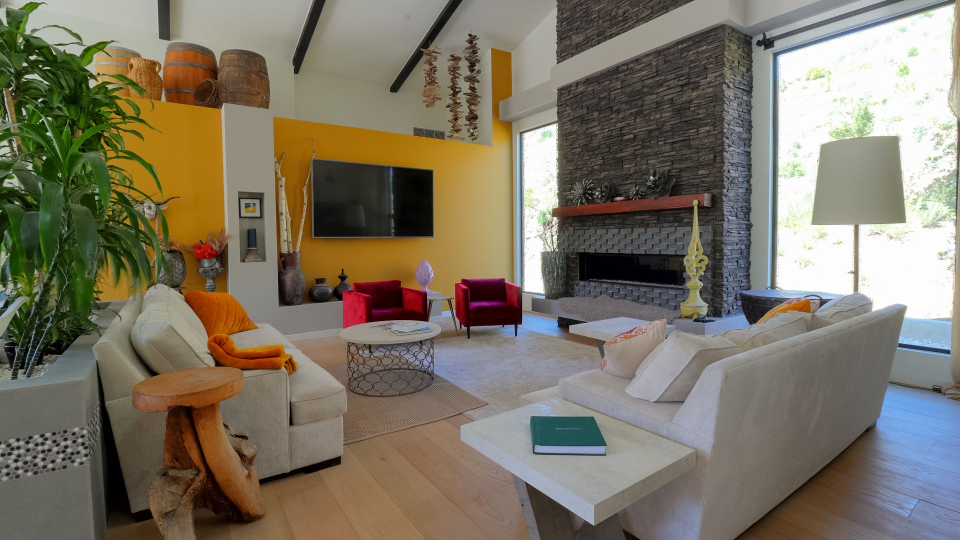
For the interior, our client wanted the main bay to feel large, high, and uninterrupted. The challenge was trying to create this space without using columns, which would have broken up the room too much. We opted to run a large steel beam in the center of the ridge line so that the beam carries the majority of the load from the roof and rests on the adjacent walls. This helped us achieve the large living space that continues through to the kitchen and outside. The only place we used columns was for the mezzanine overlooking the living area. To us this was acceptable because it gives the space more verticality that breaks up the room in an attractive way. We included tall windows at the rear that allowed natural light in and for a view of the entire hill which was planned to have new landscaping.

