The Toscana Influence
Culver City, CA
The Story
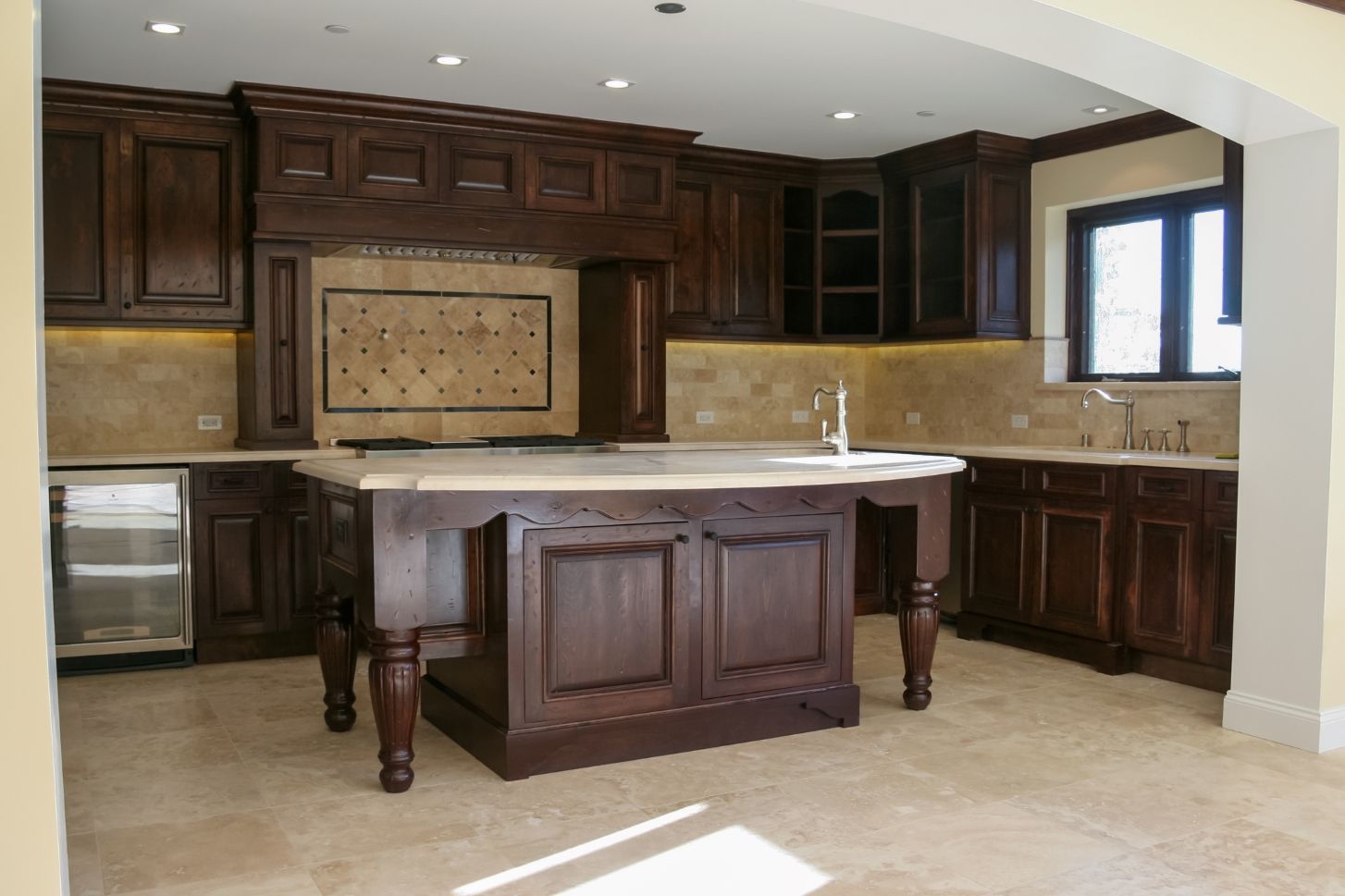
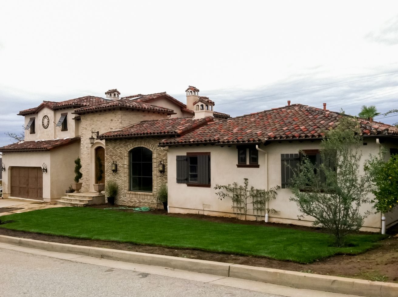
This property was a yellow California Ranch home when our client initially came to us with the proposal of transforming it to a Spanish style. We would later come to interpret this as a Toscana period home when we became more familiar with our clients design needs. The geography of the lot called for a country-like design that was more landscape appropriate. With the site being horizontal and wide, we felt the home should roll through the landscape in an appropriate manner. When looking at the front facade you can see it's composed of multiple roof volumes, with the entry being subtle. This was contrary to the San Gimignano Toscana style, which calls for tall and dominant entries. Our goal was to provide authentic period architecture but at a more quaint scale, rather than being overpowering as the medieval era tends to be.
We sourced period accurate Toscana materials, going as far as to emulate the layering of stucco and brick which was common during that time. Natural stones were included for the entrance while we used stucco in other areas. We also needed to make sure all features were functional. The shutters we installed were not only authentic but they actually functioned as they should have during the original period. Constructed of beautiful wood and painted a dark gray, these shutters added legitimacy to the style, especially on the large window seen from the front facade. Ultimately, we needed to make sure our proportions didn’t overpower or start to be out of context so everything would come together harmoniously. It was important to our client that we applied this approach to remain as authentic as they had desired.
